Build a logistic model from data
Like exponential and logarithmic growth, logistic growth increases over time. One of the most notable differences with logistic growth models is that, at a certain point, growth steadily slows and the function approaches an upper bound, or limiting value. Because of this, logistic regression is best for modeling phenomena where there are limits in expansion, such as availability of living space or nutrients.
It is worth pointing out that logistic functions actually model resource-limited exponential growth. There are many examples of this type of growth in real-world situations, including population growth and spread of disease, rumors, and even stains in fabric. When performing logistic regression analysis, we use the form most commonly used on graphing utilities:
Recall that:
- [latex]\frac{c}{1+a}[/latex] is the initial value of the model.
- when b > 0, the model increases rapidly at first until it reaches its point of maximum growth rate, [latex]\left(\frac{\mathrm{ln}\left(a\right)}{b},\frac{c}{2}\right)[/latex]. At that point, growth steadily slows and the function becomes asymptotic to the upper bound y = c.
- c is the limiting value, sometimes called the carrying capacity, of the model.
logistic regression
Logistic regression is used to model situations where growth accelerates rapidly at first and then steadily slows to an upper limit. We use the command “Logistic” on a graphing utility to fit a logistic function to a set of data points. This returns an equation of the form
Note that
- The initial value of the model is [latex]\frac{c}{1+a}[/latex].
- Output values for the model grow closer and closer to y = c as time increases.
- Use the STAT then EDIT menu to enter given data.
- Clear any existing data from the lists.
- List the input values in the L1 column.
- List the output values in the L2 column.
- Graph and observe a scatter plot of the data using the STATPLOT feature.
- Use ZOOM [9] to adjust axes to fit the data.
- Verify the data follow a logistic pattern.
- Find the equation that models the data.
- Select “Logistic” from the STAT then CALC menu.
- Use the values returned for a, b, and c to record the model, [latex]y=\frac{c}{1+a{e}^{-bx}}[/latex].
- Graph the model in the same window as the scatterplot to verify it is a good fit for the data.
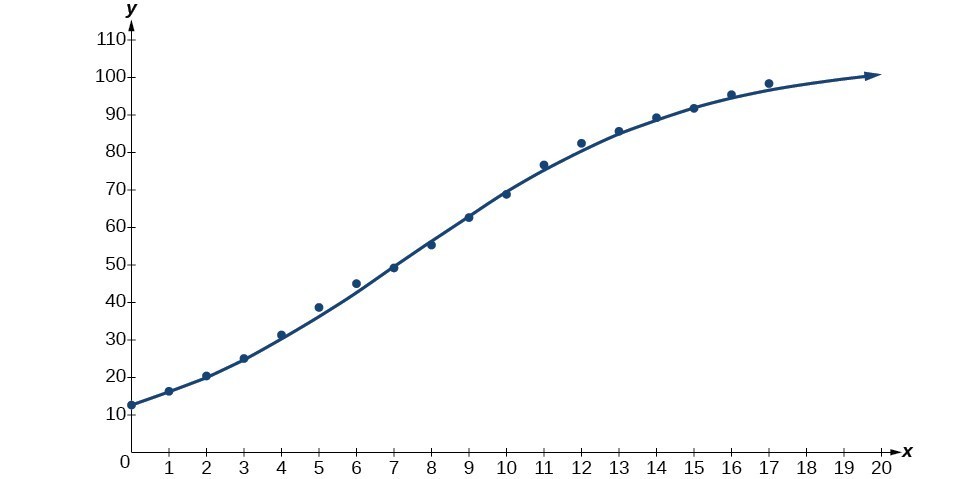
Mobile telephone service has increased rapidly in America since the mid 1990s. Today, almost all residents have cellular service. The table below shows the percentage of Americans with cellular service between the years 1995 and 2012.[1]
| Year | Americans with Cellular Service (%) | Year | Americans with Cellular Service (%) |
|---|---|---|---|
| 1995 | 12.69 | 2004 | 62.852 |
| 1996 | 16.35 | 2005 | 68.63 |
| 1997 | 20.29 | 2006 | 76.64 |
| 1998 | 25.08 | 2007 | 82.47 |
| 1999 | 30.81 | 2008 | 85.68 |
| 2000 | 38.75 | 2009 | 89.14 |
| 2001 | 45.00 | 2010 | 91.86 |
| 2002 | 49.16 | 2011 | 95.28 |
| 2003 | 55.15 | 2012 | 98.17 |
- Let x represent time in years starting with x = 0 for the year 1995. Let y represent the corresponding percentage of residents with cellular service. Use logistic regression to fit a model to these data.
- Use the model to calculate the percentage of Americans with cell service in the year 2013. Round to the nearest tenth of a percent.
- Discuss the value returned for the upper limit, c. What does this tell you about the model? What would the limiting value be if the model were exact?

- Source: The World Bank, 2013. ↵