- Recognize effective visual media use in business communication
- Learn how to revise and enhance visuals to make them more impactful
- Explore techniques and tools to make visual media accessible for as wide an audience as possible
- Assess how effective a message is
Visuals in a Report
Reports don’t end when you graduate from school. In fact, businesses that are publicly traded usually prepare an annual report each year for their stockholders and investors. That annual report might be a hundred or more pages of highly detailed information, including strategic plans and financial data, and will certainly include visuals.
Let’s take a look at a few annual reports from well-known companies. We’re going to study what they’ve written, the visual media they’ve chosen to use to support their written word, and if that choice of visual media meets our visual media standards of clarity, consistency, relevancy, and persuasion.
Target: Charts, Graphs and Tables
“Expect more. Pay less.” That’s Target’s brand promise to its customers. Target is one of the most identifiable brands in the world, and you don’t need to look past the cover of Target’s 2022 annual report featuring their red and white bullseye to know exactly who made it.
Let’s take a look at page 3 of their report to see how their clean, crisp style is translated into their report’s charts and graphs.
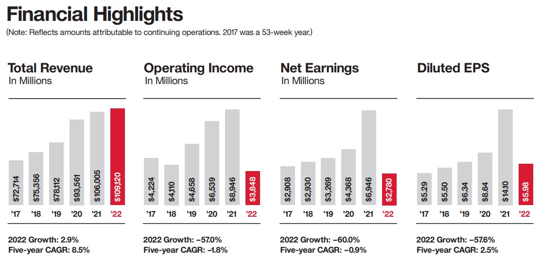
The first set of charts shows their financial highlights in a set of four bar graphs that compare five years of sales, operating income, net earnings, and diluted EPS (that’s ‘earnings per share’). The charts are simply labeled and captioned appropriately with earnings and CAGR (that’s ‘compound annual growth rate’). You can see at a glance that while Target’s total revenue has steadily grown, their net earnings dropped so they weren’t quite as profitable as the prior four years.
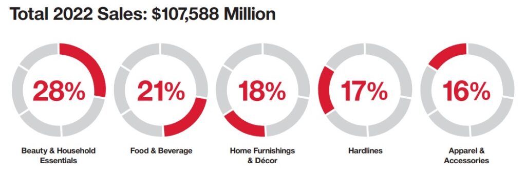
The second set of charts shows their total segment sales. They’ve chosen pie charts to display this information because they’re showing what portion of total sales each department has contributed. Notice that this is actually one pie chart shown five times, each with a different department highlighted. You can easily see that Beauty & Household Essentials at 28% make up the largest category of sales.
- Are these charts clean, clear, and simple? Very much so. They feature only the information we need to see. The font they chose is easy to read, and the colors stand out.
- Are they uniform? Definitely. The styles of the bar charts and the pie charts are the same size, they use the same colors.
- Are they on-brand and relevant? Most certainly. Target has used their brand colors, they’ve maintained their clean, crisp style, and their pie charts are the outside ring of the bull’s eye. The information is relevant in that, here on page three of the report, they’ve shown you all the financial data that 90% of readers open the report to find.
- Are they persuasive? Yes. As it turns out, a more in-depth look at their financials is featured in the remainder of the report.
All of the information in the financial highlights bar charts on page 2 is featured in a table on page 6 too. This table, which is on brand with its easy-to-read font and its Target red headers, allows the audience to dig in and really understand the numbers they saw initially. Again, this table follows our visual media standards in that it’s clear, consistent, relevant, and persuasive.
Target does an excellent job incorporating charts, graphs, and tables into its reports.
Earnings Per Share (EPS) is a financial metric that divides a company's profit by the outstanding shares of its common stock, indicating how much money each share earns. It's a way to gauge a company's profitability on a per-share basis, helping investors to assess the company's financial health and profitability.
The Compound Annual Growth Rate (CAGR) is a way to show how much an investment grows each year over a period of time, as if it grew at a steady rate. It smooths out the real ups and downs to give you a simple yearly growth number. The CAGR tells you the average rate at which your investment increased each year, considering the effect of your earnings being reinvested and growing along with the original amount.
Net Earnings refer to the total profit a company earns after all expenses and taxes have been subtracted from its total revenue. It's a key indicator of a company's financial health.