Visual Design Principles
Business communicators don’t always have access to a graphic artist. You don’t need to be a graphic artist to use basic principles of visual design in your communications.
Contrast
Contrast is when two aspects of an image are strikingly different from one another, like dark and light. Contrast is an important principle in visual design and helps highlight the important part of the image. It adds weight to your design and guides the viewer’s eye to what you want them to see.

Deciding where to pull the viewer’s eye and why is essential. Contrast can help viewers quickly decide where to find the most crucial information in a design, such as in an advertisement, flyer, or when navigating a website.
Alignment
Alignment creates a sharp, linear order to the elements of your visual, so they all have a connection to each other. If objects are closer together, the viewer assumes that they’re related. This principle is known as proximity.
In the first image of trees below, we see six trees in one group that are in two rows even though they’re not precisely linear. In the second image, we perceive two groups of three.

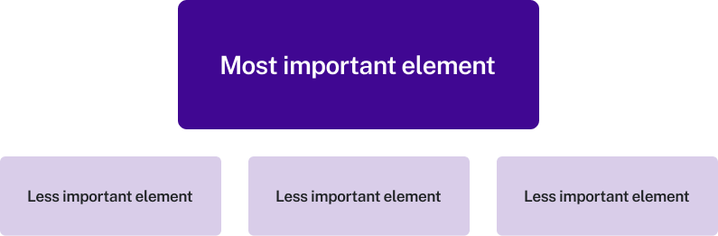
Hierarchy
If there are multiple elements in a design, more visual weight should be given to the most important part of the graphic. Establish the most essential part of the graphic first, and then fill in the rest with the less important parts. Hierarchy can be achieved using some of the other visual principles, like color, contrast, scale, and proximity.

Repetition and Pattern
Repetition strengthens the overall design and ties together elements to make them more consistent. This technique is often used in branding to make items more recognizable.
Color
Color is an important choice in visual communication because each color has a meaning. If you’re following brand guidelines, your colors will reinforce your brand, but if not, you might want to consider some of the universal associations that go along with each color. Green tends to conjure images of the environment, while red symbolizes anger, and yellow, happiness. Which of these roses looks cold to you?

However, it’s important to remember that associations with color can vary depending on culture. For example, in Western cultures, the color red can be associated with passion or danger. In China and other Asian countries, red symbolizes luck and prosperity.