- Learn when to use tables, charts, diagrams, and infographics
- Determine the best visual aid to present your data
- Understand how the placement, style, and color of graphics affect your message
- Learn about the importance of using descriptive captions and titles with graphics
Types of Graphics
In this age of information, there are huge amounts of data to process and an equally impressive number of graphs and charts you can use to tell the data’s story. This is often called data visualization. Here are some of the more commonly used graphs and the kinds of stories they can help you tell.
Numerical Data Charts
Bar Graphs
Bar graphs are used to compare categories. The x-axis (the horizontal line at the bottom of a graph) is usually used to show the categories: in this case, various countries. The y-axis (the vertical line) isn’t marked here, but it shows the employment rate of people with disabilities and those without. The taller the bar, the higher the percentage of people who are employed. This chart shows that the United States has a larger employment gap than most other countries displayed. This is identified on this chart with bars in contrasting colors.

Line Graphs
Like bar graphs, line graphs compare categories, but they’re most often used to show trends. With the x-axis frequently showing the passage of time, the graphed data points will show an upward or downward trend of the categories in question.
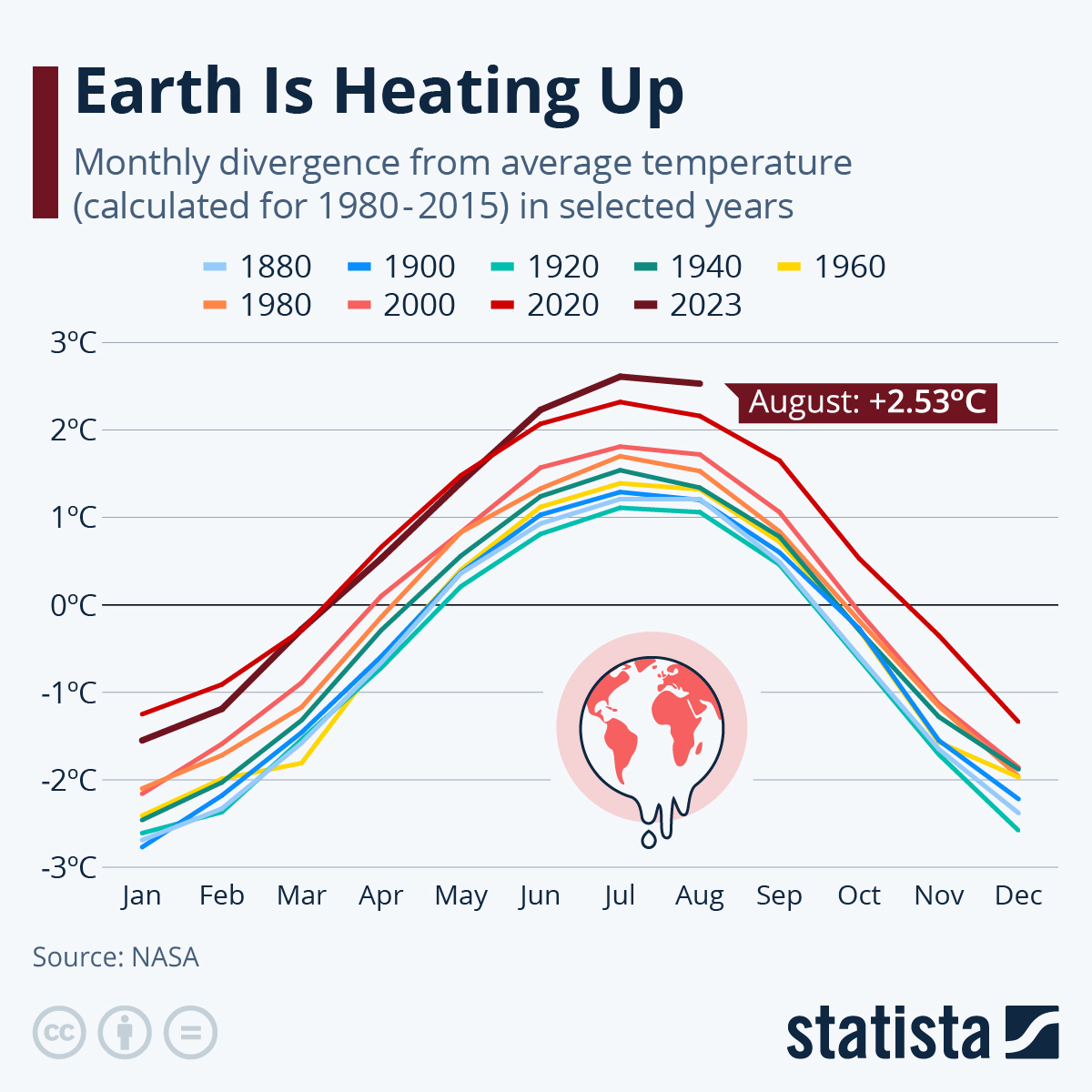
The line graph above illustrates changes in annual temperature trends over time. Each year is represented by a different colored line. The x-axis shows the passage of time (months of the year), and the y-axis shows the difference from the average temperature. The graph shows that average temperatures in every month of the year are rising over time.
Pie Charts
Pie charts show the composition of data or the pieces of a whole.
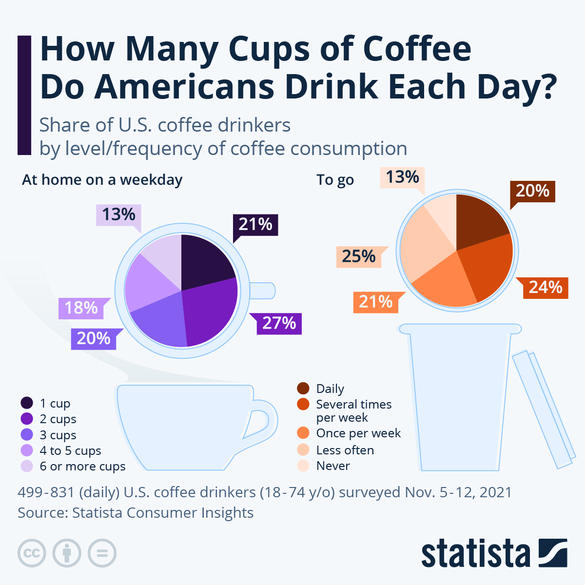
In Figure 3, the whole pie (the whole circle) represents the total number of people who drink coffee. On the left, the pieces represent the percentage of people who consume different amounts of coffee at home on a weekday. On the right, the sections represent the percentage of people who get their coffee to go during the week.
Some comparison charts aren’t shaped like a circle. Sometimes they’re shaped like donuts, and other times they’re shown using bars, as we’ll see next.
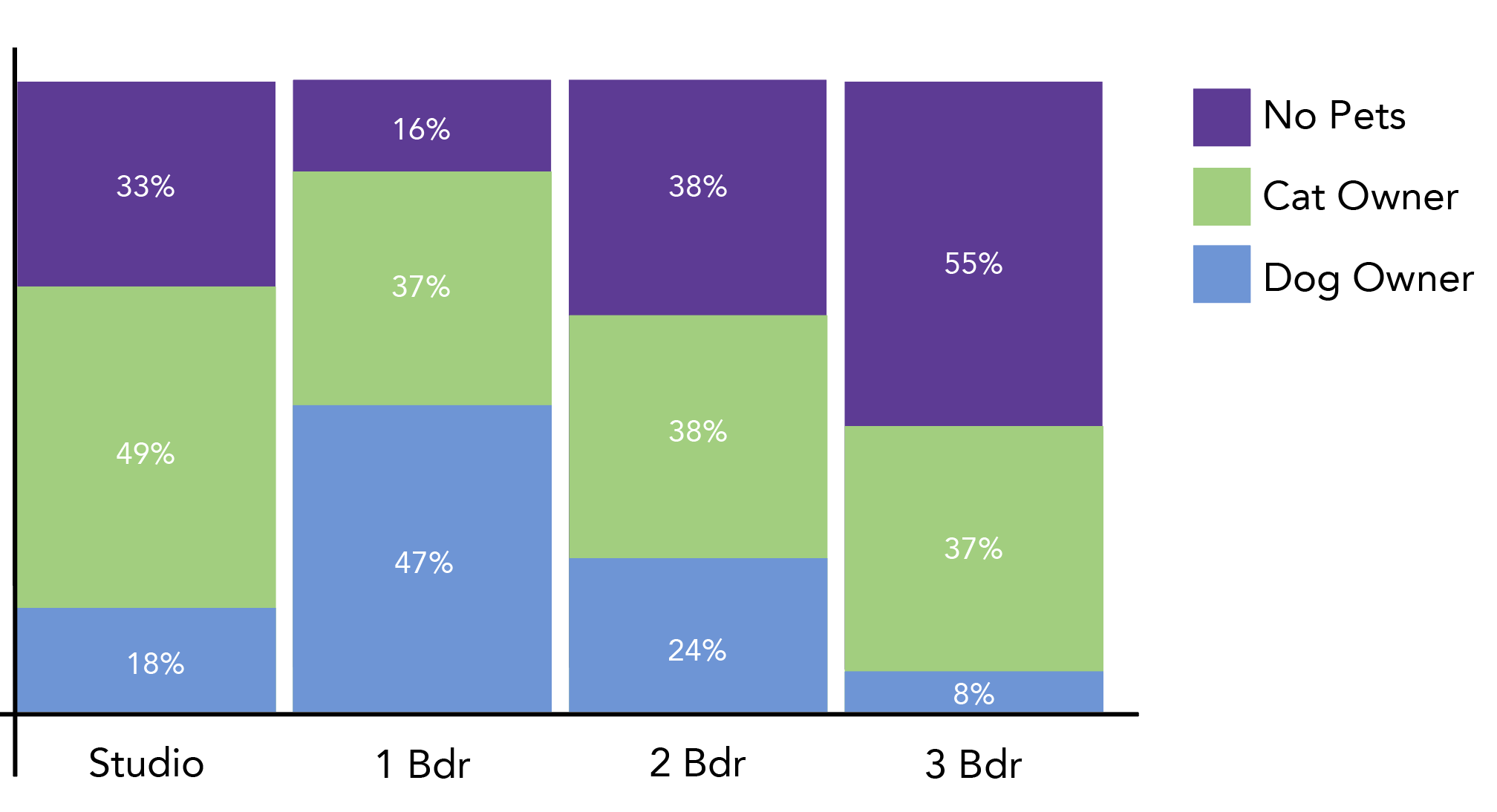
Stacked Comparison Charts
You can compare categories with a “pie chart” approach, incorporating the composition factor in a variety of ways. The categories in this chart, people who lived in different sizes of homes, are represented by bars, but the bars themselves are composition charts. Each bar is valued at 100%, and the colored blocks represent different types of pet ownership within the population.
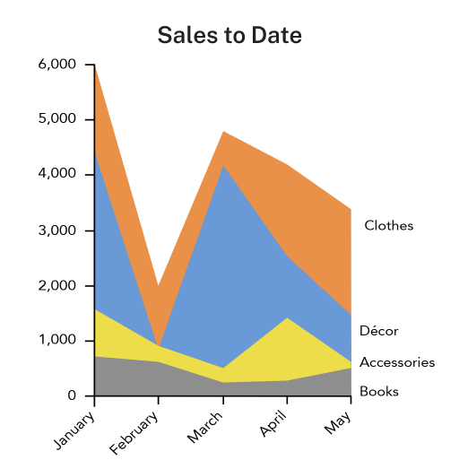
Similarly, the line graph below is “stacked” to show the level of sales based on product type. You’re seeing a trend as well as a portion of a whole – comparing and viewing composition.