Non-Numerical Data Charts
There are charts for other types of data that are not based on numbers.
Venn Diagrams
A Venn diagram shows a comparison of two different categories and the items they have in common. The diagram in Figure 1 shows us the different image types that can be safely shared on the Internet.
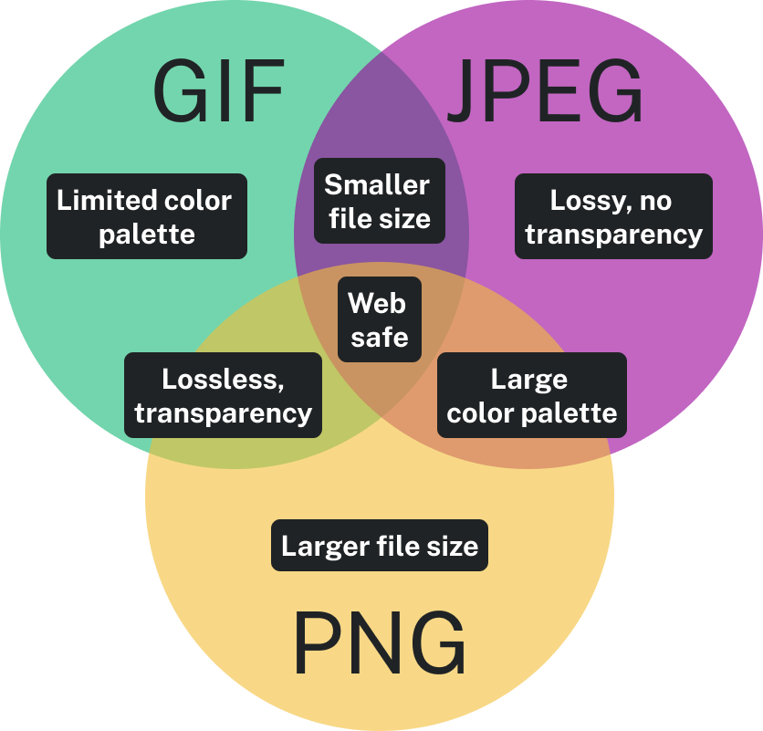
Wherever the circles overlap represents a shared characteristic. For example, JPG and PNG files both have a large color palette, so they overlap in that area. “Web safe” is a characteristic shared by all three, so it’s in the middle where all the circles overlap. Areas of each circle that do not overlap represent characteristics unique to each file type—something they don’t share with any other file type represented.
Flow Charts
Flow charts show a process. Flow charts document a sequence of events from start to finish so that the process can be documented, followed, and managed.
The flow chart in Figure 2 shows the process of how theories are created, spread, and accepted.
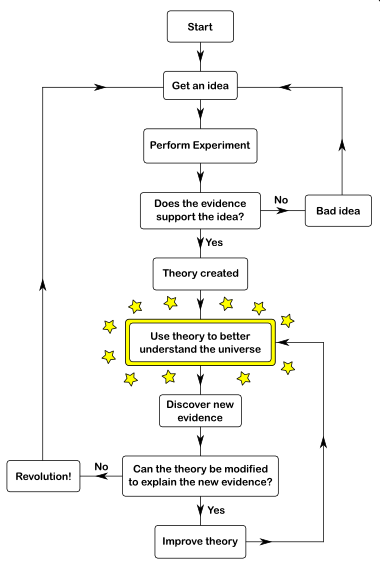
You can see at the top there is an idea that leads to an experiment, and then the results determine which path is taken. If the experiment is successful or unsuccessful, then different paths will be chosen. Along the path of the flow chart, all alternatives are presented and choices are made between them. Your eye follows the path from start to finish for every part of the scenario.
Gantt Chart
A Gantt chart is a timeline. Multiple projects can be added to the timeline with start and finish dates, and milestones and deadlines are also reflected. This chart is used to determine how long a project will take, the resources needed, and the order in which tasks need to be completed.
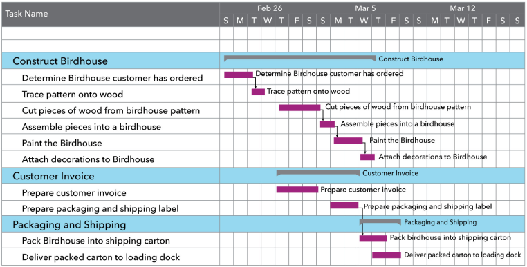
In Figure 3, the tasks needed to build a birdhouse are displayed against time. On the left of the chart are all the tasks, and along the top is the time scale. A bar represents each work task; the position and length of the bar indicate the start date, duration, and end date of the task. At a glance, we can determine the following:
- What the various activities are
- When each activity begins and ends
- How long each activity lasts
- Where activities overlap with other ones, and by how much
- The start and end date of the whole project
Organizational Charts
Organizational charts (sometimes called hierarchy charts) show the people in an organization and their reporting relationships. Usually, the organizational chart will have a president or CEO at the top, followed by vice presidents, then their direct reports, and so on. An organizational chart is usually created and maintained by human resource professionals who want a visual view of their organization’s structure and reporting relationships so they can make better decisions about leveraging the company’s talent.
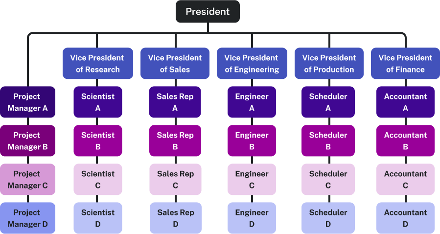
The organizational chart in Figure 4 shows a president at the top of the hierarchy. Directly reporting to the President are five Vice Presidents, each responsible for distinct operational areas: Research, Sales, Engineering, Production, and Finance. The VPs have four subordinate roles below them, each would report directly to the role above.