Pictographs
Pictographs use symbols and images to convey data, information, or ideas. They are also called icons. The pictographs in Figure 9 are part of a resume and signal what kind of information can be found next to each pictograph (phone number, address, Twitter handle, and email respectively).
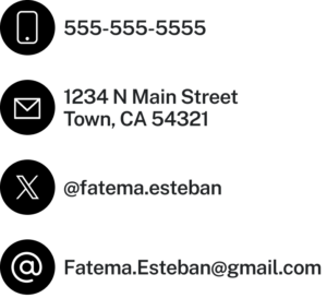
This makes it easier for a recruiter to view and pick out the necessary contact information. Other pictograms can convey processes (like the instructions to build IKEA furniture) or information (like when the weather app on your phone tells you it’s going to rain today by posting a picture of a rain cloud).
Transparency in Communication[1]

Google’s Incognito web browsing mode is presented with a “spy guy” icon. In internal emails, Google’s employees believed that pairing the name “Incognito”, which means someone in disguise, with the spy guy icon was misleading users into thinking that Google was not tracking their information.
In reality, Google was collecting was still collecting data on what people searched and the websites they visited. Now Google has settled a class action lawsuit and agreed to delete millions of user search histories. Google has also updated the information shown when you open an Incognito tab to more transparently describe what information is and is not collected.
Infographics
Similarly, infographics use pictures, but they also incorporate data and words, all to explain a single point. Infographics can be used to make a complex subject a little simpler to understand, particularly when there are more than two or three factors to consider. They can also be used to compare two or more categories and make your data more interesting and eye-catching.
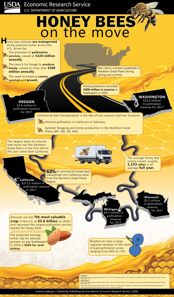
This infographic presents information by using a combination of visual elements and numerical data to illustrate the economic impact of honey bee pollination. By integrating maps, icons, and bold numbers, it highlights key statistics and facts in a manner that is easy to scan and understand. The color scheme is thematic and helps to draw attention to different sections with an eye-catching and entertaining quality that’s engaging and interesting to the audience.
Even More Charts and Graphs: This is not an all-inclusive list of the kinds of charts and graphs available. If you work in the science arena, you may find yourself using scatter charts or heat maps. Statisticians might be reaching for a trellis chart or even a function graph.
Learn what graphs your industry relies on most and take the time to familiarize yourself with them so you can use these important visual communication tools to your advantage.
Making Charts and Graphs with Free Tools
As we mentioned earlier in this module, all graphs and charts that you see on the internet are someone else’s property, and using them in your work is stealing. But there’s little reason to use someone else’s chart—you can create your own chart to communicate your own data! Here are a few tools that can help you create something great:
- MS Excel. This Microsoft app includes charts and graph tools that allow you to create data visualizations from the data on your spreadsheet. Google Sheets includes a similar feature.
- Lucidchart. If it’s flowcharts you’re looking for, Lucidchart is the right place to start. This free, easy-to-use resource allows you to create flowcharts, organizational charts, and diagrams that look impressive.
- Gliffy. This website helps you create diagrams and can be used by students free of charge for up to four years.
- Beam. This tool allows you to make engaging graphs and charts, even on your mobile phone.
- BeFunky, Visme, and Canva. Don’t let infographics intimidate you! Infographics are easily created with the BeFunky, Visme, and Canva tools. These tools have free versions and include hundreds of images and templates to help you make a stunning visual.
- Picktochart. These tools incorporate artificial intelligence (AI) to help you generate a graphic with a written description. Picktochart allows you a limited number of AI infographic generations each month.
There are other very powerful data visualization tools available that incorporate AI but are paid services. For example, ChatGPT-4 can take data from files like spreadsheets and generate a graph or chart with your written instructions.
Tables
A communicator can also use tables to display data. Tables can be formatted for words or numerical data. They can be used for comparing data or displaying several data points associated with one item.
Table 1 is a simple table of three people who are running races. George, Alana, and Sebastián each have four data points associated with them. By using a simple table, you can put all of this data in front of your audience. They can compare the best times and review the rankings of each runner.
| Table 1. Running a Race | ||||
|---|---|---|---|---|
| Participants | Races Run | Best Time | Average Time | Ranking |
| Marquis | 2 | 2:58 | 3:25 | 3 |
| Alana | 3 | 2:53 | 3:12 | 1 |
| Sebastián | 2 | 2:56 | 3:20 | 2 |
Table 2 is a bit more complex, and because of that, the data is not quite as accessible to the reader. But the data is complex as well, and if it’s going to be displayed for ease of review, this seems like a decent choice. Table 2 shows the results of a survey where participants were asked to rank eight speakers (a male and a female of different English Language dialects) according to their professionalism, intelligence, education, friendliness, and sociability. The response rates are shown for male and female speakers, and then an average is calculated for each dialect.
| Table 2. Average Perceptions of English Speakers* | |||||
|---|---|---|---|---|---|
| Standard American English | |||||
| Gender | Professional | Intelligent | Educated | Friendly | Extroverted |
| Female Speaker | 5.83 | 5.83 | 5.75 | 5.42 | 4.92 |
| Male Speaker | 6.92 | 6.67 | 6.75 | 6.42 | 6.33 |
| Southern American English | |||||
| Gender | Professional | Intelligent | Educated | Friendly | Extroverted |
| Female Speaker | 5.75 | 5.17 | 5.00 | 7.25 | 7.00 |
| Male Speaker | 4.33 | 4.17 | 3.75 | 5.92 | 6.42 |
| British English | |||||
| Gender | Professional | Intelligent | Educated | Friendly | Extroverted |
| Female Speaker | 7.50 | 7.33 | 7.33 | 5.50 | 5.25 |
| Male Speaker | 6.50 | 6.25 | 6.17 | 5.17 | 4.92 |
| Australian English | |||||
| Gender | Professional | Intelligent | Educated | Friendly | Extroverted |
| Female Speaker | 7.00 | 6.92 | 7.08 | 6.25 | 6.42 |
| Male Speaker | 6.92 | 6.92 | 6.75 | 6.17 | 6.00 |
| *Participants in this survey were asked to rate speakers on a scale of 1–10. | |||||
Tables help you manage more complex sets of data. A table can be used if you’re looking to display individual values, if values are being compared, or if data is going to be shown and then summarized. They won’t convey your story to the reader as quickly as a graph might, but you will still be conveying a large amount of information in an easy-to-understand way.
- Allyn, Bobby. “Google to Destroy Private Browsing History of Millions Who Used ‘Incognito Mode.’” NPR, April 2, 2024. https://www.npr.org/2024/04/02/1242196805/google-to-destroy-private-browsing-history-of-millions-who-used-incognito-mode ↵