- Recognize what makes an image suitable for business messages
- Understand when to use an image and when text is better
- Understand how to legally obtain images for your business communications
Using Images
When creating a message take a moment to you ask yourself, “Would including an image strengthen or support the message more than text alone?” Studies show that content that includes images receives up to 94% more views than content without images. Users are 40 times more likely to share visual content on social media, and consumers are 80% more likely to read a piece of content if it contains colorful visuals.[1]
Visual images can greatly increase the comprehensibility and understanding of a message. But how do you choose the right picture to match your content? Apply the visual media standards discussed earlier:
- The image should be clear and simple.
- The image should have the same look and feel as the other images in the document to convey visual uniformity.
- The image should persuade the reader (or at least convey some emotion).
- The image should fit with your company’s brand.
Let’s take a look at each of these by checking out the websites of some companies you’re familiar with.
Clear and Simple Images
A company that has a clear and strong visual identity is Apple. Apple is a technology company committed to bringing the best computing experiences to its customers. The clear, clean look of Apple’s website conveys a message to the customer: Our technology is sleek, bold, and easy to use.
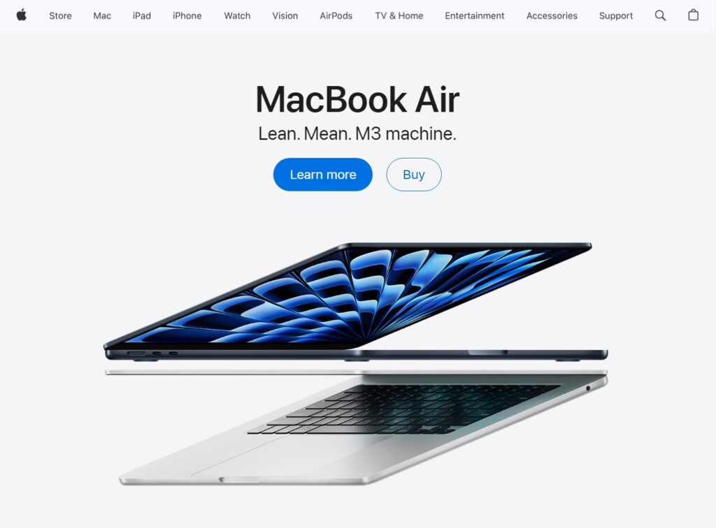
Apple’s website features an eye-catching blue wave shape on the screen of a sleek laptop, drawing the viewer’s attention but not competing with the product itself. Imagine if the screen featured a photo of a child or a cute pet. Would you be looking at the product then, or the content on the screen? Clean and simple images surrounded by white negative space help you convey a singular idea.
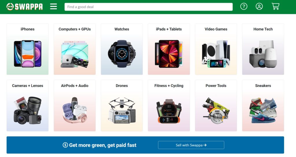
Conversely, Figure 2 shows a website that sells new and gently used electronics. Considering this company is trying to sell multiple types of products on one platform, what type of impact factor does it have? How would you compare the impact of this website to Figure 1?
Uniform Images
Swappa’s website makes use of uniform images to create a cohesive and visually appealing layout, which helps users quickly and easily navigate the page. Here’s how uniformity is advantageous:
- Consistency: The images have a consistent style and size which makes the marketplace appear orderly and professional.
- Recognizability: The products in each category are represented by easily recognizable and relevant images, aiding in quick identification.
- Aesthetic Appeal: Uniform images maintain a neat and clean appearance, which can be visually pleasing and encourage users to browse longer.
- Brand Identity: The consistent use of images can strengthen brand identity, as users begin to associate the visual style with the marketplace.
In Figure 2, you can see that the bands of color above and below the product photos adds weight to the design, drawing the viewers’ eyes down to the menu at the top and the tagline at the bottom of the page, “Get more green, get paid fast,” adding some insurance that they’ll read the whole page.
Now let’s take a look at a website that doesn’t use similar images or uniform layouts on its front page (Figure 4). How does the visual representation of products impact your desire to purchase a product from the company? In Figure 4, no two images are alike, and the audience doesn’t really know where to look—not a very successful use of images.

Persuasive Images
As a nonprofit organization, UNICEF relies on donations to work towards its mission of ending preventable child deaths. This puts them in a unique position where their main business messages must be persuasive enough to inspire people to donate money to support their quest. On UNICEF’s main homepage (Figure 4) the viewer is presented with a compelling image. Here you have four young children depicted as happy little kids. The message this image is trying to project is that the donor’s money is put to good use and that by supporting this organization UNICEF creates results.

Other design elements to note are the colors on their site (Figure 4). In the entire photo, except for the children, the image has been digitally altered so that the building has been re-tinted blue. The altered image now aligns with the colors associated with the UNICEF brand.
The brand color is then contrasted by the children’s bright yellow raincoats. Not only do the yellow raincoats stand out and catch your eye, but the color yellow is often associated with happiness. The effects of color on an image can have a large impact on how a brand, or image connected to a message, is perceived by viewers. The only red on the page appears on a button that draws the viewer’s attention with an appeal to “Donate.”
On-Brand Images
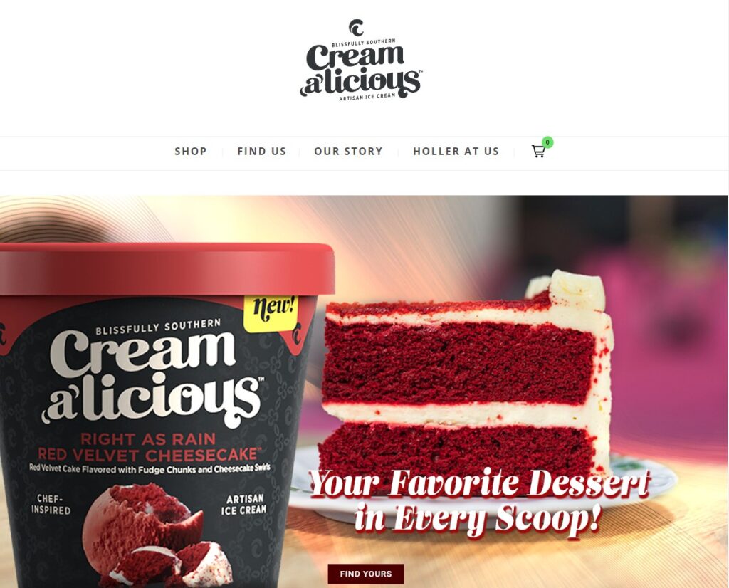
Creamalicious was founded by Chef Liz Rogers and produces artisan ice cream in flavors inspired by homemade Southern desserts like sweet potato pie, peach cobbler, and pecan pie.[2] Their website features a vibrant image of the ice cream tub alongside a slice of red velvet cake. This not only tempts the viewer with a real-life depiction of the flavor but also underlines the brand’s promise of delivering the full experience of a dessert in ice cream form.
The tagline “Your Favorite Dessert in Every Scoop!” reinforces the brand’s commitment to crafting flavors that resonate with well-loved desserts, connecting with consumers’ nostalgia and preferences. The design choices, like the curvy font and the image of the cake, create a warm and inviting atmosphere. The use of the terms “chef-inspired” and “artisan” on the product packaging further aligns with a narrative of craftsmanship and quality.
On the other hand, take a look at a website for a children’s juice manufacturer Penny Juice (Figure 6). Upon first impression, this homepage does not convey any clear message about its brand promise or what the company stands for:

In fact, the cartoon figures and use of colors might lead the audience to have a difficult time identifying the product. As a viewer, you might have ideas or suggestions for how to convey the message of “We sell juice for kids!” in a more effective manner. Possibly a cartoon of a smiling child drinking a sippy cup full of juice or images of fruit would be a better hint. This visual does not efficiently communicate the brand.
A tagline is a memorable phrase that succinctly communicates the essence, purpose, or brand promise of a company, product, or service, often used in marketing campaigns.