Bad Presentations
You would think that modern technology would lead to better, more compelling presentations. Interestingly, the problem is, to some extent, the technology. It’s estimated that 30 million PowerPoint presentations are created every day, with a majority of presenters opting for default layouts and templates. The problem is, we’re wired for story, not bullet points. Potentially good presentations become bad when we rely too much on presentation slides as a script which negatively impacts the speaker’s verbal and non-verbal delivery.
In response to a question regarding “death by PowerPoint” on the TechTarget Network, Margaret Rouse provided this definition: “a phenomenon caused by the poor use of presentation software,” identifying the primary contributors of this condition as “confusing graphics, slides with too much text and presenters whose idea of a good presentation is to read 40 slides out loud.”[1]
Too Much vs. Too Little
The common denominator of presentation mistakes is that they represent a failure of communication. This failure can be attributed to two errors: too much or too little. The error of too much information on presentation slides is generally the result of trying to use slides as a teleprompter or a substitute for a report. Too much prompts audience members to walk out or tune out, turning their attention instead to doodling or checking their device of choice. You can probably think of a time when you watched a speaker read directly from their slides for most of the presentation. Did you find it engaging? If the entire presentation is on slides, what purpose does the speaker serve?
What bad presentation slides also have in common is too little attention to the emotive part of delivery due to focusing on getting through the slides. Presentation expert and author Gar Reynolds captures the crux of the problem: “A good presentation is a mix of logic, data, emotion, and inspiration. We are usually OK with the logic and data part, but fail on the emotional and inspirational end.”[2] There’s also a hybrid too little-too much mistake, where too little substance and/or no design sensibility is — in the mind of the presenter — offset by transitions and special effects.
The 10/20/30 Rule
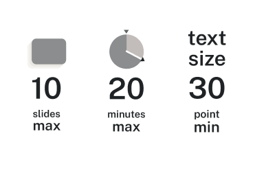
The 10/20/30 rule, generally attributed to venture capitalist Guy Kawasaki, is a good guideline to help you achieve a balance in your presentations. In brief, 10/20/30 translates to a maximum of 10 slides, a maximum of 20 minutes, and a minimum of 30-point font.[3]

While this rule is a good starting point, it doesn’t overrule your audience analysis or understanding of your purpose. Sometimes, you may need more slides or have a more involved purpose—like training people in new software or presenting the results of a research study—that takes more than 20 minutes to address. In that case, go with what your audience needs and what will make your presentation most effective. The concept behind the 10/20/30 rule is to make new learning easy for your audience to take in, process, and remember.
- Rouse, Margaret. "What is death by PowerPoint?" TechTarget Network. March 2023. https://whatis.techtarget.com/definition/death-by-PowerPoint ↵
- Reynolds, Garr. “10 Tips for Improving Your Presentations Today.” Presentation Zen. Nov 2014. http://www.presentationzen.com/presentationzen/2014/11/10-tips-for-improving-your-presentations-lectures-speeches.html ↵
- Kawasaki, Guy. "The 10/20/30 Rule of PowerPoint." December 2005. https://guykawasaki.com/the_102030_rule ↵