-
- Organize data using tables, charts, and graphs
- Create and analyze side-by-side and stacked bar graphs
- Create and analyze graphs of quantitative data
Visualizing Data
Recall that categorical data is data that is separated into distinct categories. Categorical variables are described using words. The count of each category is collected, which can be displayed using a table or a graph.
The Main Idea
Frequency tables list all the types of a categorical variable along with how many there are of each. Each category total is divided by the total of all the data to obtain the proportion of the total data that is contained in the category. The proportion may then be converted to a percentage, which is often called the “relative frequency.”
Ex. In a particular statistics class, [latex]10[/latex] students major in business, [latex]5[/latex] major in biology, and [latex]12[/latex] major in health sciences. We can find the proportion of each major in the class by dividing the number appearing in that major by the total students. There are [latex]27[/latex] total students given in the [latex]3[/latex] majors. [latex]\dfrac{10}{27}\approx0.37[/latex], which tells us about [latex]37%[/latex] of the class majors in business.
Bar graphs can also display either the count of each category or the proportion or percentage, depending on how the vertical axis is labeled.
The horizontal axis lists each category of the variable.
If the vertical axis lists counts of each, then the height of each bar above its category indicates the number of individual observations in that category.
If the vertical axis lists percentages, then the height of the bar will indicate the proportion or percentage of each category out of the total observations.
A Pareto chart is a bar graph ordered from highest to lowest frequency.
Pie charts display either percentages or counts of each category arranged as slices of pie. The size of the slice corresponds to the proportion of observations in the category.
In our example of the majors present in a statistics class, we calculated that [latex]37%[/latex] of the students major in business. [latex]\dfrac{5}{27}\approx0.185[/latex], which tells us [latex]18.5%[/latex] major in biology. [latex]\dfrac{12}{27}\approx0.444[/latex] indicates that about [latex]44.4%[/latex] major in health sciences. The percentages don’t total to [latex]100%[/latex] due to rounding.
See the video below for a visual demonstration of how these charts are constructed from data collected on a categorical variable.
You can view the transcript for “Bar Chart, Pie Chart, Frequency Tables | Statistics Tutorial | MarinStatsLectures” here (opens in new window).
Interpreting Side-by-Side and Stacked Bar Graphs
The Main Idea
Side-by-side bar graphs are bar graphs that represent data for two categorical variables from more than one group by creating two bars on the chart for each group. Side-by-side bar graphs are most efficient when presenting data counts (not percentages).
Stacked bar graphs also represent data for two categorical variables from more than one group but stacked rather than side-by-side. Stacked bar graphs are most efficient when presenting percentages of the data in each group (not counts).
The example problem below presents the same data displayed four different ways: as a contingency table (counts), as a conditional distribution (percentages), as side-by-side bar graphs (counts), and as stacked bar graphs (percentages). This won’t always be the case; sometimes a bar graph will display percentages, but these examples represent efficient uses of these displays. Also note that these bars are vertical, but some side-by-side and stacked graphs are displayed horizontally.

- How many [latex]3[/latex]rd year students identified themselves as heavy drinkers?
Now let’s look at the data as percentages rather than counts.

Note that the percentages are given in decimal form. Multiply by [latex]100[/latex] to convert to percentages. Each row adds up to [latex]1[/latex] ([latex]100%[/latex]) of all responses for each class year. We can see that the [latex]27[/latex] of [latex]95[/latex] [latex]2[/latex]nd year students we located in the table above is represented in this table as [latex]\dfrac{27}{95}\approx0.284[/latex], which is about [latex]28.4%[/latex].
- What percentage of [latex]3[/latex]rd year students identified themselves as heavy drinkers?

Here, we see the data from the contingency table displayed as side-by-side bar graphs. The horizontal axis contains the four class years of students while the vertical axis indicates the height of each bar in numbers of students. The differently colored bars each represent an alcohol consumption category.
1. Try to locate the [latex]27[/latex] second-year students who identified as light drinkers. What color is the bar and where is it located along the horizontal axis?
2. Which class year reports the most moderate drinking?

Finally, we see the information from the conditional distribution displayed as stacked bar graphs.
1. Which class year reported the lowest proportion of heavy drinkers?
2. How did alcohol consumption change from class year to class year?
Dot Plots and Histograms
The Main Idea
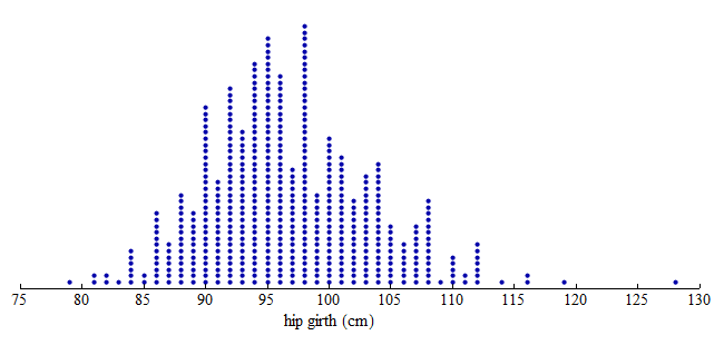
A dot plot takes a collection of quantitative data points and distributes them across a horizontal axis (a number line). Each value is represented by a single dot on the dot plot. Identical values get stacked up so we can tell at a glance which values showed up in large quantities in the dataset and which are rarer. From a dot plot, if there aren’t too many data points, we can count the number of observations and locate the exact median of the data. We can also discern the shape of the data distribution (is it symmetric or bunched up to one side or the other?).
A histogram is like a bar chart for quantitative variables. It takes all the data measurements collected and groups them into bins of equal width. The person creating the histogram, whether by technology or by hand, chooses the bin-width. The smaller the bin, the finer the detail, and vice-versa, large bin-width may hide detail by flattening out variation in the data. From a histogram, we can see summary information about the data set and discern the shape and center of the data.
The two videos below demonstrate how to read and interpret these quantitative graphs.
You can view the transcript for “Interpreting Dot Plots” here (opens in new window).
You can view the transcript for “Distributions and Their Shapes” here (opens in new window).
To create a histogram, divide the variable values into equal-sized intervals called bins. In this graph, we chose bins with a width of [latex]5[/latex] cm. Each bin contains a different number of individuals. For example, [latex]48[/latex] adults have hip measurements between [latex]85[/latex] and [latex]90[/latex] cm, and [latex]97[/latex] adults have hip measurements between [latex]100[/latex] and [latex]105[/latex] cm.

Here is a histogram. Each bin is now a bar. The height of the bar indicates the number of individuals with hip measurements in the interval for that bin. As before, we can see that [latex]48[/latex] adults have hip measurements between [latex]85[/latex] and [latex]90[/latex] cm, and [latex]97[/latex] adults have hip measurements between [latex]100[/latex] and [latex]105[/latex] cm.

Note: In the histogram, the count is the number of individuals in each bin. The count is also called the frequency. From these counts, we can determine a percentage of individuals with a given interval of variable values. This percentage is called a relative frequency.