Boxplots
For visualizing data, there is a graphical representation of a [latex]5[/latex]-number summary called a box plot, or box and whisker graph.
boxplot
A boxplot is a graphical visualization of a quantitative variable that shows median, spread, skew, and outliers by illustrating the set of numbers of the five-number summary (minimum, [latex]Q1[/latex], median, [latex]Q3[/latex], and maximum).
A boxplot clearly shows the center of the data set and provides a summary at a glance of the bulk of the data and the presence of outliers.
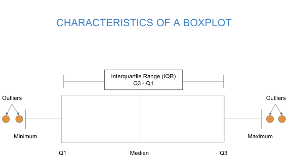
To create a box plot, a number line is first drawn. A box is drawn from the first quartile to the third quartile, and a line is drawn through the box at the median. “Whiskers” are extended out to the minimum and maximum values.
Box plots are particularly useful for comparing data from two populations.
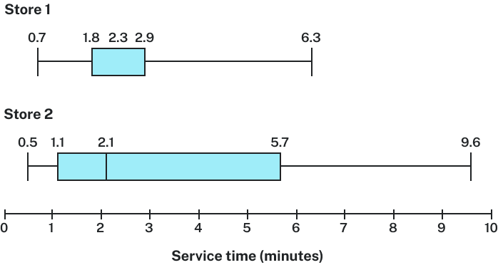
Which store should you go to in a hurry?
Interquartile Range (IQR)
The interquartile range (IQR) is a statistical measure used to describe the middle spread of a data set. It represents the range within which the central [latex]50\%[/latex] of data lies, by taking the difference between the third quartile ([latex]Q3[/latex]), which marks the top of the middle [latex]50\%[/latex], and the first quartile ([latex]Q1[/latex]), which marks the bottom of the middle [latex]50\%[/latex]. This measurement helps to understand the dispersion of the middle bulk of a data set, providing a clearer picture of its distribution by reducing the influence of outliers.
IQR
The interquartile range (sometimes denoted as IQR) is the difference between the quartiles calculated as [latex]Q3 – Q1[/latex].
The IQR represents the range of the middle half of the values in the data set and is often used to describe the typical spread.
The IQR can be used to find the limits of the upper and lower outliers.
How To: Calculate the Lower Outlier Limit
- Lower Limit = [latex]Q1 − (1.5 × IQR)[/latex]
- Any data point below this limit is considered a lower outlier.
How To: Calculate the Upper Outlier Limit
- Upper Limit = [latex]Q3 + (1.5 × IQR)[/latex]
- Any data point above this limit is considered an upper outlier.
Boxplots can tell us about the shape of a distribution. The shape of a distribution refers to how data is spread out across the range of values, encompassing characteristics like symmetry, skewness, and the presence of outliers. Skewness specifically describes the degree of asymmetry in the distribution; it’s a measure of how much the distribution leans to one side.
skew
- Left skewed: A cluster of data on the right with a tail of data tapering off to the left.
- Symmetric: A cluster of data where the left and right sides of the distribution closely mirror each other.
- Right skewed: A cluster of data on the left with a tail of data tapering off to the right.
For boxplots, how can we describe the center of the distribution? With mean and median, of course! Recall the effect that skew has on the relationship between the mean and median in a data set. A right-skewed data set will pull the mean to the right of the median while a left-skewed data set will pull the mean to the left. We can use visual clues to observe the skew in a boxplot.

- Do you notice any skew in the dotplot of this data set?
- Can you point out the corresponding outliers in the boxplot of the data?
- What is the relationship between the mean and median of the data? Is the mean less than, greater than, or roughly similar to the median?
- What can you conclude about the shape of the data?
- What visual clue in the boxplot led to your conclusion?