Trendlines
Trendlines in a spreadsheet chart represent graphs that nicely fit the data of your scatterplot, like the line of best fit you discovered when you completed this gasoline consumption scenario in the Linear and Geometric Growth Learn It pages. In that example, you visually inspected the scatterplot for a pattern and noticed that the data very nearly approximated a straight line. You chose two data points and used them to write the recursive and explicit forms of the linear relationship present in the data. Starting with 111 billion gallons consumed in the year 1993, you found the slope to be [latex]2.2[/latex] billion gallons of gas consumed per year: [latex]P_{n}=111+2.2n[/latex].
In the equation above, [latex]P_{n}=111+2.2n[/latex], the output variable is represented as [latex]P[/latex] per unit of input [latex]n[/latex]. We could have just as appropriately written it as [latex]P\left(n\right)=111+2.2n[/latex] or even as [latex]y=111+2.2n[/latex].
We need to adjust the data that our chart is using for the input values. We currently have a list of years in the input column, which yields a nice presentation of the data but, If we wish to obtain an equation to use as a model for this situation, we need to change the perspective of our input to get a more meaningful mathematical statement. We’ll need to change the input information from years to the number of years after a starting year.
Let’s see what equation we obtain when we let Excel choose the line that best fits the data. In this example, we will obtain an unexpected result in step 1, then we’ll adjust the chart to fix it in step 2.
Spreadsheet Hands-On: Choose a trendline
The examples shown below will use the Microsoft Excel spreadsheet but you can also use an open source spreadsheet such as Apache OpenOffice Calc or Google Sheets.
Step 1: Selecting the trendline from a menu.
Click on the chart you made previously then click on the topmost style box that appears, the one with a plus-sign in it, to open the Chart Elements box. Hover your mouse over the Trendline choice, click the right-arrow, then choose More Options… to open the Format Trendline pane.

- Click the radio button next to the Linear trendline option.
- Click “Display Equation on chart.”
- Click “Display R-Squared value on chart.”
When you’ve made those choices it should look like the image below. You can close the Format Trendline pane at this point. Excel places the equation and R-Squared value directly over the scatterplot, making it difficult to read. You can click the textbox containing them and move it down if you wish.
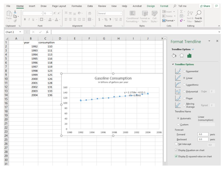
Excel has given us a trendline equation of [latex]y=2.1758x-4225.1[/latex] and an R-Squared value of [latex]0.9946[/latex]. The R-Squared value is a measure of how well the trendline fits the data: the closer to [latex]1[/latex], the better. an R-Squared value of [latex]0.9946[/latex] indicates that our data very closely matches the trendline. But what about the equation? It differs from the explicit form you wrote when you completed this example previously. We’ll examine why, then make an adjustment to the chart so that they match more closely.
Step 2: Analyzing the trendline
The trendline that Excel gave us is [latex]y=2.1758x-4225.1[/latex]. This equation follows the form of a linear equation, [latex]y=mx+b[/latex], with slope of [latex]2.1758[/latex] and an initial value of [latex]-4225.1[/latex]. The slope is similar to the slope of [latex]2.2[/latex] we obtained by hand in the Linear and Geometric Growth Learn It pages, but the constant is way off, and negative. Why is that?
Excel is reading the input values as numbers, not as we are perceiving them, as years. That is, the software interprets the number 1993 as one thousand nine-hundred ninety-three years after the starting year, year zero. We want it to read 1993 as the first input so that we have a starting value of approximately 111. We’ll need to change our data from years to years since 1993 to match the equation we obtained earlier. Recall that you left column A empty in the beginning. Let’s use it now.
Step 3: Adjusting the data source
- Since we want to make the gas consumption in the year 1993 our starting value for the equation, we need to start with the data point [latex](0, 111)[/latex]. This will mean the quantity consumed in 1992 will correspond to an input of [latex]-1[/latex], one year prior to 1993. Type [latex]-1[/latex] in cell A2 and [latex]0[/latex] in cell A3, then grab the handle and fill the series down to cell A14. It should look like the image below.

-
-
- Right-click on your chart and choose Select Data from the menu that appears.
- Click the word Edit in the Legend Entries (Series) tab ribbon to open the Edit Series box.
- Note that the Series X values row (the middle row shown) is currently populated with values in Sheet6!$B$2:$B$14. (Your sheet number will be different, and will correspond to the name of the sheet tab at the bottom of your page. For example, if you had renamed Sheet1 to Gas, your X values series data would be listed as =Gas!$B$2:$B$14.) The idea is that the spreadsheet is populating the input axis with the numbers found in column B, as shown in the image below.
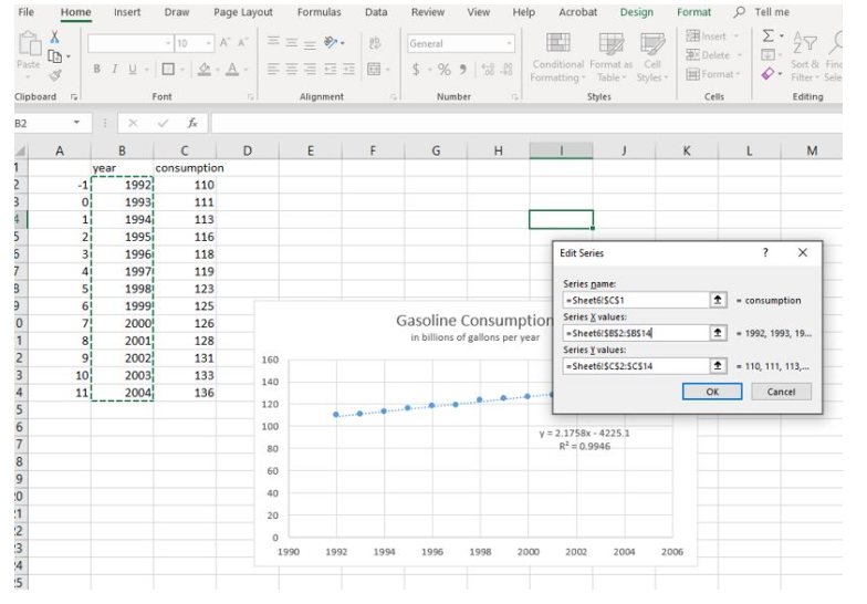
Figure 4. Edit the series names We need for it to instead use the numbers in column A. You can edit the row by changing the two Bs to As. Click OK. The Select Data Source box reappears and you can see that the data for the Horizontal (Category) Axis Labels now includes the data in column A (see below).
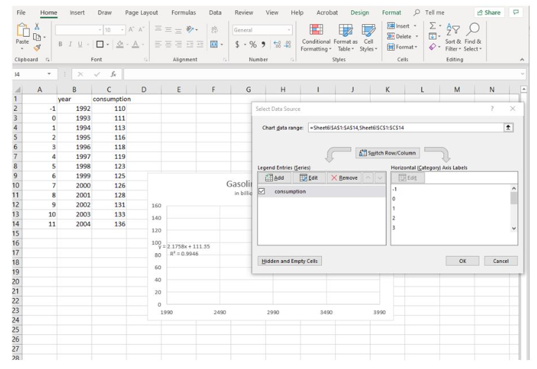
Figure 5. Adjust the graph the use the numbers in columns A
- Click OK in the Select Data Source Box. As you do so, note that the highlight box that had been on column B has moved to column A, indicating that’s where the data is now sourced. But the graph is blank. We need to adjust the input starting value, which is still starting from [latex]1990[/latex].
- Click on your chart then double-click on any number in the horizontal axis label text box to open the Format Axis pane. Under Axis Options, Bounds, click the Reset button to set the minimum to [latex]-1[/latex] and the Maximum to [latex]12[/latex]. The graph should have reappeared as shown below.
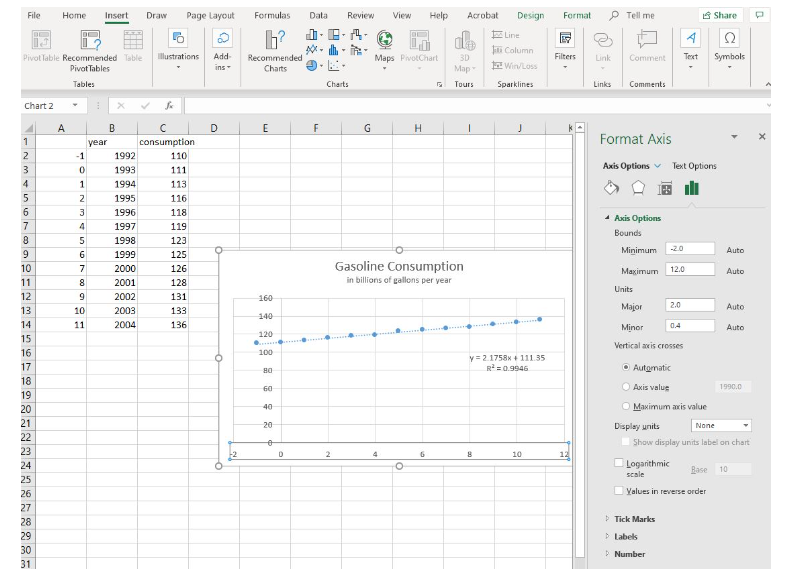
Figure 6. Adjust the starting value from 0 to -2 on the x-axis Note the equation of the line of best fit is now [latex]y=2.1758x+111.35[/latex]. This compares very closely to the equation you wrote by hand in the Linear and Geometric Growth Learn It pages. Let’s examine them:
Original explicit form: [latex]P_{n}=2.2n+111[/latex]
Excel trendline equation: [latex]y=2.1758x+111.35[/latex]Let [latex]y=P_{n}[/latex] and [latex]x=n[/latex], then we have [latex]P_{n}=111.35+2.1758n[/latex], which is very similar to the equation you wrote by hand.
As you become more familiar with working in a spreadsheet, you’ll find using technology to analyze situations numerically is generally more efficient than doing it by hand. But the technology can only act as a tool for your understanding. Without your knowledge of the process of modeling and why it works, the tool is likely to reveal unexpected and confusing results.
-