- Use a spreadsheet to create a scatterplot
- Use a spreadsheet to generate a trendline for a scatterplot
- Analyze a trendline for appropriateness and fit
Data Visualization and Analysis Using Spreadsheets
In today’s data-driven world, the ability to visualize and analyze trends is an invaluable skill. In this ‘Apply It’ activity, you’ll embark on a journey through various data sets, using spreadsheets to create scatterplots and generate trendlines. These tools are not just mathematical functions but powerful lenses through which we can interpret the world. From a local business’s sales figures to the ebb and flow of visitors in a city park, and even customer ratings for an online store, each scenario will challenge you to apply your knowledge in new and insightful ways.
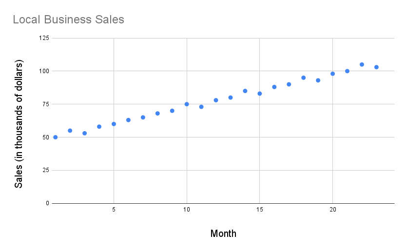
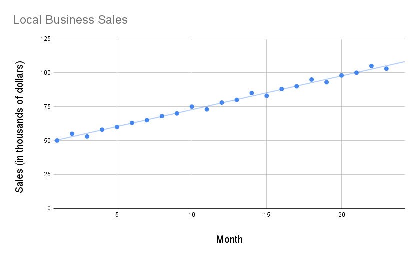
Scenario 1: Local Business Sales Data
You have been given monthly sales data for a local business for the past two years below. Your task is to visualize this data and analyze sales trends.
| Month | Sales (in thousands of dollars) |
|---|---|
| 1 | [latex]50[/latex] |
| 2 | [latex]55[/latex] |
| 3 | [latex]53[/latex] |
| 4 | [latex]58[/latex] |
| 5 | [latex]60[/latex] |
| 6 | [latex]63[/latex] |
| 7 | [latex]65[/latex] |
| 8 | [latex]68[/latex] |
| 9 | [latex]70[/latex] |
| 10 | [latex]75[/latex] |
| 11 | [latex]73[/latex] |
| 12 | [latex]78[/latex] |
| 13 | [latex]80[/latex] |
| 14 | [latex]85[/latex] |
| 15 | [latex]83[/latex] |
| 16 | [latex]88[/latex] |
| 17 | [latex]90[/latex] |
| 18 | [latex]95[/latex] |
| 19 | [latex]93[/latex] |
| 20 | [latex]98[/latex] |
| 21 | [latex]100[/latex] |
| 22 | [latex]105[/latex] |
| 23 | [latex]103[/latex] |
| 24 | [latex]108[/latex] |
Using a spreadsheet, create a scatterplot of the monthly sales data. Ensure that the [latex]x[/latex]-axis represents the months (from [latex]1[/latex] to [latex]24[/latex]), and the [latex]y[/latex]-axis represents the sales figures.
Add a trendline to your scatterplot. Choose a trendline type that you believe best fits the data.
After dissecting the sales trends of a local business, let’s shift our focus to the digital world. In the next scenario, you’ll analyze customer review ratings for an online store. This transition from physical sales data to digital consumer feedback will test your adaptability and analytical skills, showcasing how different types of data require unique approaches to interpretation.
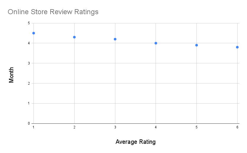
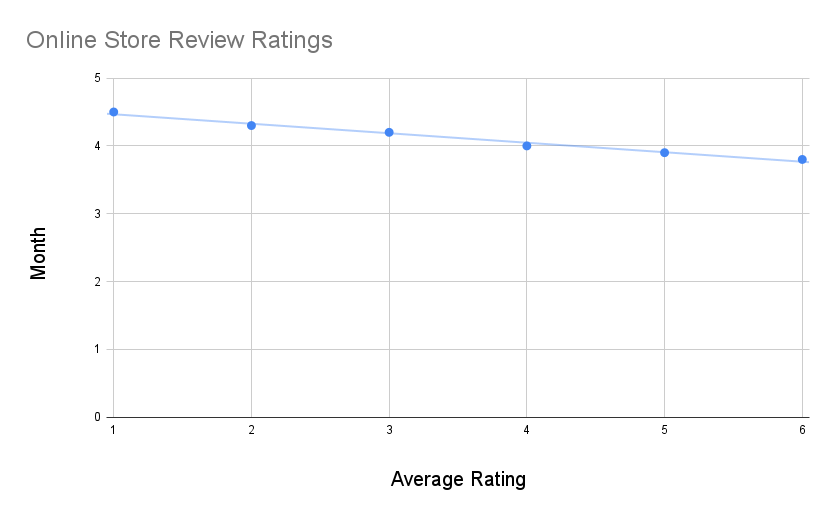
Scenario 2: Online Store Review Ratings (Over Six Months)
An online store has been collecting customer review ratings for various products over the last six months. The ratings are on a scale from 1 to 5.
| Month | Average Rating |
|---|---|
| 1 | [latex]4.5[/latex] |
| 2 | [latex]4.3[/latex] |
| 3 | [latex]4.2[/latex] |
| 4 | [latex]4.0[/latex] |
| 5 | [latex]3.9[/latex] |
| 6 | [latex]3.8[/latex] |
Create a scatterplot using the ratings data. Then, generate a trendline to analyze the pattern of customer ratings over time. Discuss your choice of trendline and its appropriateness.