Modeling and Analysis: Apply It 1

  • Differentiate correlation from causation
  • Decide on the suitability of interpolation and extrapolation
  • Identify the appropriate way to represent data and mathematical models
  • Use multiple representations to choose a model
  • Recognize the limits of models

What a Wonderful World!

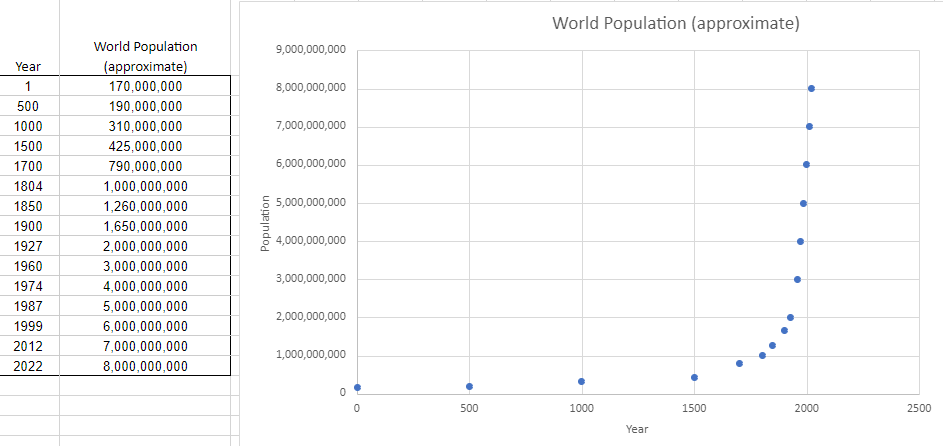
The following table and graph show the approximate world population at various time points since [latex]1[/latex] AD.

The image displays a split-screen view with a data table on the left and a scatter plot on the right, both titled "World Population (approximate)". The table lists historical years in the first column from 1 to 2022 and corresponding world population estimates in the second column, ranging from 170,000,000 to 8,000,000,000. The scatter plot graphically represents this data with the x-axis labeled "Year" spanning from 0 to 2500 and the y-axis labeled "Population" ranging from 0 to 9,000,000,000. Blue dots on the plot mark the population at each year listed in the table, displaying a gradual increase in early years with a sharp exponential growth evident from around the 1800s onwards.


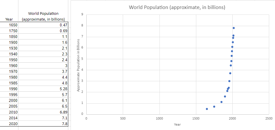
The following table and graph give a different view of the history of the approximate world population (in billions). In this case, the estimates are at various time points since 1650.

The image is a combined display featuring a data table on the left and a scatter plot on the right, each titled "World Population (approximate, in billions)". The table has two columns: Year and World Population (approximate, in billions) with years ranging from 1650 to 2020 and population figures in billions from 0.47 in 1650 to 7.8 in 2020. The scatter plot represents this data with the x-axis labeled Year from 0 to 2500 and the y-axis labeled Approximate Population in Billions from 0 to 9. The blue dots on the plot correspond to the years and populations listed in the table, showing a gradual increase initially, followed by a steep rise in the 20th century.