Enhancing Your Written Analyses of Graphical Displays
In today’s data-driven world, the ability to interpret graphical displays is more crucial than ever. However, it’s not just about understanding the data; a well-written analysis can illuminate patterns, provide context, and offer actionable insights that can be pivotal in decision-making processes.
The Art of Interpretation
Interpreting graphical displays is more than a skill—it’s an art form that requires a nuanced approach. To truly enhance your written analyses, you must dig deeper than just reading the axes and data points. This involves understanding the context in which the data exists, recognizing underlying patterns, and making insightful inferences. A well-crafted analysis not only describes what is visually represented but also delves into why it’s important, answering critical questions like, “What does this trend indicate?” or “Why is this data point an outlier?”
When interpreting graphs, don’t just look at the data points; consider what they represent. For example, if you’re analyzing a graph about climate change, each data point could represent a year’s worth of temperature data. Understanding this can help you make more meaningful interpretations.
Think about stock market graphs. Investors don’t just look at the ups and downs; they try to understand why certain events caused the market to behave a certain way. Your approach to interpreting graphs should be similarly holistic.
Making Connections: Context Matters
While the art of interpretation is crucial, it’s not the only skill you need. To make your analysis truly insightful, you must also consider the broader context in which the data exists. For example, if you’re looking at a graph showing a sudden spike in online retail sales, consider external factors like holidays, promotions, or even current events that could explain the surge. Contextualizing your analysis makes it more insightful and actionable.
Before diving into the graph, do some background research. Knowing the industry trends, seasonal factors, or relevant current events can add depth to your analysis.
In the field of public health, understanding the context is crucial. If a graph shows a sudden increase in flu cases, knowing that it’s flu season makes the data less alarming. Similarly, a sudden drop in restaurant sales might be less concerning if you know a major holiday just occurred.
Writing Insightful Analyses of Graphs
The process of writing an insightful analysis starts with understanding the importance of context. Knowing where the graph originates and who its intended audience is can offer valuable insights into what the graph aims to convey. This enriches your analysis by providing a foundational understanding that guides your interpretation. For instance, a graph intended for a scientific community may include jargon or units of measurement that are not commonly understood by the general public. Being aware of this can help you tailor your analysis to be more relevant and impactful.
After you’ve grasped the context, it’s time to structure your analysis. A scaffolded approach can be particularly helpful here, ensuring that you don’t overlook any crucial elements:
How to: Steps for Written Analysis of Graphic Displays
-
Describe:
Start by describing what you see. Identify the type of graph you’re dealing with—is it a bar graph, a line graph, or perhaps a pie chart? Note the variables that are being compared. This sets the stage for your reader, giving them the necessary background to understand your subsequent points.
-
Interpret:
Next, discuss the trends, patterns, or anomalies you notice. Are the data points generally increasing or decreasing? Is there a noticeable correlation or perhaps an outlier that warrants attention? This is where your analysis starts to dig deeper, going beyond the surface to explore what the graph is really telling you.
-
Evaluate:
At this stage, critically assess the graph. Look for any biases that might affect the data’s interpretation. Are the scales misleading? Is the data source reliable? This step adds a layer of rigor to your analysis, ensuring that the insights you provide are both accurate and trustworthy.
-
Conclude:
Finally, sum up your analysis by stating the graph’s overall significance. What story does it tell? Does it confirm a known theory, or does it challenge conventional wisdom? Your conclusion should encapsulate the key points of your analysis and highlight their broader implications.
By following these steps, you ensure that your analysis is not just comprehensive but also methodically structured, making it easier for your reader to follow your thought process and understand the graph’s significance. After completing the individual steps, your next task is to integrate these elements into a cohesive paragraph. This unified narrative should guide the reader through your logical thought process, effectively turning raw data into meaningful insights.
Suppose you’re examining a graph that shows the incidence of a particular disease over several years. A well-written analysis would not only note the trends but also explore possible reasons for any fluctuations, such as changes in public health policy, climate, or population density.
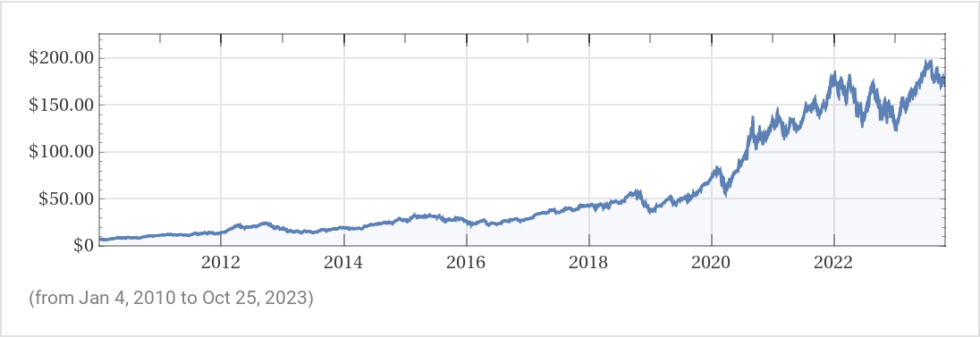
Analyze the stock chart below, which shows the closing price of Apple Inc. from 2010 to today. Write a short paragraph using the steps outlined above.