- Use a spreadsheet to calculate the mean, median, and mode for a data set
- Use a spreadsheet to calculate the range and standard deviation for a data set
- Create graphical comparisons between two data sets to identify differences in their characteristics
The examples below are the same examples covered in this section but using Google Sheets instead of Microsoft Excel. Microsoft Excel is great but we sometimes might not have access to the paid version and need a free alternative such as Google Sheets.
Data Exploration: [latex]3[/latex]x[latex]3[/latex] Speed Cube Competition

A group of [latex]50[/latex] students at a hypothetical math camp was given instruction in an algorithm used to teach beginners how to solve a [latex]3[/latex]x[latex]3[/latex] speed cube. None had ever learned a method for solving one before. After a week of practice, they were each asked to solve [latex]10[/latex] cubes and record their average solving time. Their average times to solve [latex]10[/latex] cubes in seconds are listed below.
| [latex]129[/latex] | [latex]122[/latex] | [latex]115[/latex] | [latex]100[/latex] | [latex]108[/latex] | [latex]129[/latex] | [latex]131[/latex] | [latex]145[/latex] | [latex]118[/latex] | [latex]96[/latex] |
| [latex]149[/latex] | [latex]95[/latex] | [latex]118[/latex] | [latex]158[/latex] | [latex]131[/latex] | [latex]135[/latex] | [latex]145[/latex] | [latex]98[/latex] | [latex]123[/latex] | [latex]161[/latex] |
| [latex]166[/latex] | [latex]110[/latex] | [latex]145[/latex] | [latex]96[/latex] | [latex]157[/latex] | [latex]158[/latex] | [latex]117[/latex] | [latex]115[/latex] | [latex]103[/latex] | [latex]145[/latex] |
| [latex]143[/latex] | [latex]94[/latex] | [latex]97[/latex] | [latex]154[/latex] | [latex]162[/latex] | [latex]111[/latex] | [latex]110[/latex] | [latex]137[/latex] | [latex]150[/latex] | [latex]145[/latex] |
| [latex]119[/latex] | [latex]155[/latex] | [latex]112[/latex] | [latex]129[/latex] | [latex]140[/latex] | [latex]139[/latex] | [latex]164[/latex] | [latex]158[/latex] | [latex]134[/latex] | [latex]98[/latex] |
We’d like to explore the shape, center, and variability of the data to gain some understanding. Let’s start by opening a new workbook and saving it somewhere safe. You should save your work frequently or enable an auto-save feature. Rename Sheet1 as Speed Cube Times.
Spreadsheet Hands-On: Use a Spreadsheet to Perform Descriptive Statistics
The examples shown below will use Google Sheets but you can also use the Microsoft Excel spreadsheet or an open-source spreadsheet such as Apache OpenOffice Calc.
Step [latex]1[/latex]: Load the data set
- Before inserting the data, type a label into column A. This can be whatever you choose to help you keep track of what is there, even something simple such as “Dataset.” Type the [latex]50[/latex] numbers from the table above into the spreadsheet in column A. You may be able to copy them from the text page and paste them into the worksheet. If so, you’ll need to transpose the the rows into columns. To do so, after pasting the data in the spreadsheet, you’ll have [latex]5[/latex] rows of [latex]10[/latex] columns. Select the first row and copy it. Right click on another cell and in the option “Paste special,” choose “Transposed.” Continue until you have all five rows in column A in cells [latex]2[/latex] through [latex]51[/latex]. Then, delete the tabular data.
- The data doesn’t need to be in any particular order right now, but it will be helpful for a bit later, so we are going to sort the data. To do so, select cells A2 – A51 where the data is. Click on Data in the ribbon above the sheet, then within Sort range, choose Sort range by column A (A to Z).
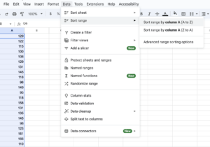
Figure 2. Load the data set in Google sheets - Check to see if you have the XLMiner Analysis ToolPak loaded into your copy of the program. Click on XLMiner Analysis ToolPak. If it is there, you already have the ToolPak. If it is not there, click Add-ons, then Get Add-ons. Search for ToolPak and select the XLMiner Analysis ToolPak when it shows up, then click install.
Step [latex]2[/latex]: Obtain the descriptive statistics.
- Sheets and other spreadsheets have function that will enable you to obtain descriptive statistics one by one. That’s time-consuming, so we’ll use the descriptive statistics feature of the Analysis ToolPak. To open the ToolPak, click Extensions, then XLMiner Analysis ToolPak, then Start. In the window that opens on the right side, select Descriptive Statistics.
- Select your data, then click into the box next to Input Range to give your data to the tool. Or just type A2:A51.
- Click in the Output Range box and choose a cell to put your summary in, like C1.
- Click to choose Summary statistics, Kth Largest (set to [latex]1[/latex]), and Kth Smallest (set to [latex]1[/latex]), and click OK. A column of statistics should have appeared, labeled Column [latex]1[/latex]. You can click that and rename it if you like.
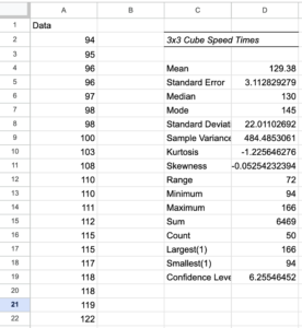
Figure 3. Obtain the descriptive statistics - Note that the Minimum value is [latex]94[/latex] and the Maximum is [latex]166[/latex]. We also checked the boxes to be given the Largest ([latex]1[/latex]) at [latex]166[/latex] and the Smallest([latex]1[/latex]) at [latex]94[/latex]. You could have chosen any number for largest and smallest, say [latex]2[/latex] or [latex]3[/latex] away from the ends of the range, just to get a feel for any outliers (unusually large or small values) in the set.
- We can read mean, median, and mode from the data, the standard deviation, and the range. Another statistic of interest will be skewness.
Now that our data is loaded and groomed, we’d like to start looking at it from different angles. Getting practice looking at various representations of data will help you learn what views work best with different types of information. We will create a frequency table and a histogram first.
You learned about creating Frequency Tables and Histograms by hand earlier in the text. Now we’ll let the program do the heavy lifting for us. But there is some preparation we must do first. You may recall that a frequency table has two columns: one for the categories and one for the frequencies. We’ll need to decide on some categories that make sense for our particular quantitative data and the class interval for each.
Step [latex]3[/latex]: Create a Frequency Table and a Histogram
Recall the details of our data set. The numbers represent the average times of novice cube solvers after a week of instruction. Perhaps we are interested in how our class of [latex]50[/latex] students has progressed and how we might like to tweak the subsequent instruction. Different representations of the spread and center of the data may yield some insight. A histogram could help us sense for how long it’s taking the students to solve a cube on average by categorizing them by equal intervals of length in seconds. But what is the best way to divide them up? Examining the range is a good place to start.
The range of the data is [latex]72[/latex]. That is, there are [latex]73[/latex] values to distribute including the fastest time of [latex]94[/latex] seconds and the slowest time of [latex]166[/latex] seconds. We want to choose class intervals (the width of each bin) that make sense for our data but choosing the intervals is a subjective task. There is a rule of thumb that says that the bins shouldn’t be too narrow or too wide to make it difficult to see the shape of the distribution. Sometimes it’s best to play around with different widths to choose the best representation. There are statistical rules that can help choose the intervals. Two that are commonly used are Sturges’ Rule and Rice’s Rule.
- Sturges’ Rule states that the number of bins should be twice the cube root of the sample size, [latex]n[/latex]. That’s [latex]2\ast \sqrt[3]{n}[/latex]. In this case, [latex]2\ast \sqrt[3]{50}\approx7.4[/latex]
- Rice’s Rule states that the number of bins should be equivalent to [latex]1+3.3\log n[/latex]. In this case, [latex]1+3.3\log50 \approx 6.6[/latex]
We can compromise on [latex]7[/latex], which gives us a class interval of [latex]10.4[/latex]. So, we’ll set the bins to be [latex]11[/latex] seconds wide and run from [latex]92 - 168[/latex].
- To create a histogram in Google Sheets, click on “Insert” and then “Chart.” In the “Setup” tab, you can then choose which kind of chart from the Chart type. Select the histogram, which is the second option in the “Other” category of the dropdown.
- Now that you have a histogram, type “A2:A51” in the box labeled “Data range” to select your data. Of course, if your data is in different cells, then put those in instead.
- Next, adjust the bins by selecting “Customize” and scrolling to the section titled “Histogram” to find the box titled “Bin size.” Input [latex]11[/latex], the bin size we decided on earlier, in this box.
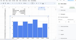
Figure 4. Create a frequency table and a histogram - Next, scroll down to “Horizontal axis” and input [latex]92[/latex] for the Min and [latex]168[/latex] for the Max.
- Select column A and then select “Insert,” then “Pivot Table.” Select “existing sheet” and type in “Sheet1!F2” to create a pivot table on that same sheet. If you have renamed your sheet, replace “Sheet1” with the name of your sheet.
- This should create the pivot table and pull up a window to edit it. In that window, select “Add” next to Rows and select the dataset, which should be shown under whatever name you gave it earlier. Do the same thing for Values, and then under Values, a dropdown for “Summarize by” should appear. In that dropdown, select “COUNTA.”
- This has created a Frequency Table for all of our datapoints individually, but we would like to create one based on our bins. To do this, write the label “Times” in cell F1 and “Bins” in G1. In the F column, write the range of each bin in our histogram. F2 will read [latex]92-102[/latex], F3 will read [latex]103-113[/latex], F4 will read [latex]114-124[/latex], and so on through [latex]158-168[/latex].
- In the Bins column, we’re going to use the =SUM() formula to add up the frequencies from our pivot table. In cell G2, type “=SUM(J4:J9)” to add the frequencies of the data points within the range [latex]92[/latex] to [latex]102[/latex] from our pivot table. Repeat this for the rest of the cells next to the F column we created in step [latex]9[/latex], replacing the range inside the parentheses with the corresponding section from the pivot table. For instance, in cell G3, we will type “=SUM(J10:J14).”
- The frequency table and histogram both indicate that the data are fairly evenly distributed in frequency. The mean and median are in agreement at about [latex]130[/latex] which indicates that the data is distributed symmetrically about the center with a standard deviation of [latex]22[/latex]. The skewness also indicates a symmetric distribution, since the skew value is very close to zero. That means we don’t have any large outliers to pull the mean in one direction or the other. Since about [latex]68%[/latex] of the data in a normal distribution lie within [latex]1[/latex] standard deviation from the center, we can be fairly certain that most of the students are solving the cube in between [latex]108 - 152[/latex] seconds. The mode is [latex]145[/latex], so there is a peak of students at that mark, on average. That doesn’t mean that most students are solving the cube at [latex]145[/latex] seconds. It just means that of all the recorded solving times, [latex]145[/latex] came up the most. A dot plot would make the mode easier to see.
Step [latex]4[/latex]: Create a dot plot.
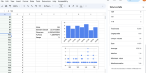
- The dot plot will have a horizontal axis containing all the integers between [latex]94[/latex] and [latex]166[/latex]. We’ll need to get frequencies for each number appearing in the data set. Essentially, we’ll move through the set, number by number, and place a dot on the chart over each number in data set. Well, we’ll have Sheets do it for us. Click into cell B1. We will use a formula called COUNTIF().
- Into cell B1, type =COUNTIF($A$1:$A1,A1), then enter. That tells Sheets to increment the count in the cell next to each data element by one if it encounters it. Select the cell again and drag that formula down through the column to B50.
- Now select Insert and then Chart. In the chart type dropdown, Sheets may suggest a scatter chart of A1:B50, but if it does not, a scatter chart is also the first option under “Scatter.” Once the correct form of graph is selected, ensure that the x-axis is A1:A50 and the series is B1:B50. The mode stands out as the tallest vertical stack of data elements on the chart.
There are more explorations we can make of this data, but they will just uncover what we’ve found so far already. Most of our students have done well and are solving the cube after one week somewhere between [latex]108[/latex] and [latex]152[/latex] seconds, with a handful of quick learners and a handful of students lagging behind. That’s nearly [latex]\frac{3}{4}[/latex] of a minute spread around the center, though. There is no clear pattern showing for the class as a whole. You may wish to revisit this data after practicing some other methods in the next sections to see if you gain more insight.
Data Exploration: Test Scores
A teacher has given her math class a test. The [latex]25[/latex] scores are listed below.
| [latex]45[/latex] | [latex]49[/latex] | [latex]50[/latex] | [latex]57[/latex] | [latex]62[/latex] |
| [latex]67[/latex] | [latex]68[/latex] | [latex]72[/latex] | [latex]72[/latex] | [latex]73[/latex] |
| [latex]78[/latex] | [latex]79[/latex] | [latex]79[/latex] | [latex]80[/latex] | [latex]81[/latex] |
| [latex]81[/latex] | [latex]81[/latex] | [latex]84[/latex] | [latex]85[/latex] | [latex]85[/latex] |
| [latex]88[/latex] | [latex]90[/latex] | [latex]91[/latex] | [latex]92[/latex] | [latex]100[/latex] |
Hands-on Spreadsheet: Explore the Data
The examples shown below will use Google Sheets but you can also use the Microsoft Excel spreadsheet or an open-source spreadsheet such as Apache OpenOffice Calc.
Step [latex]1[/latex]: Test your knowledge
Now it’s your turn to show what you can do. In your existing Sheets workbook, at the bottom of the window, click the plus sign next to the tab named Speed Cube Times to open a new page. Rename this tab Test Scores
- Store the data
- Obtain the descriptive statistics. What are the mean, median, and mode? What is the standard deviation? Does the data appear to be tightly centered or more spread out? What is the skewness? Does the mean appear to have been pulled left or right of center by any extra large or extra small values?
- Now create a frequency table and histogram. Use class intervals that correspond with letter grades: [latex]40-59[/latex], [latex]60-69[/latex], and so on.

Step [latex]2[/latex]: Create a five-number summary
You may recall from a previous section in the text that a five-number summary is a way of summarizing quantitative data using quartiles.
Excel can find the five-number summary for us.
- Type the label “five-number summary” into cell C22 and type a label for your x-axis into C23.
- Type the words Min, Q[latex]1[/latex], Q[latex]3[/latex], Max, and Median into cells D23, E23, F23, G23, and I23 respectively.
- We are going to use Sheets’ QUARTILE.INC() function to find the five-numbers. The formula takes as its input, the data list, followed by a comma, followed by a quantity. The quantity for the Min is [latex]0[/latex]. For Q[latex]1[/latex], it’s [latex]1[/latex]. For the Median, it’s [latex]2[/latex]. For Q[latex]3[/latex], it’s [latex]3[/latex]. And for the Max, it’s [latex]4[/latex]. You could also use the MIN() and MAX() functions to get those numbers. The array of data is A1:A25.
- Into cell D23, type =QUARTILE.INC(A1:A25,[latex]0[/latex]) and enter. Notice that the cell is populated with the minimum data element, [latex]45[/latex].
- Into cell E23, type =QUARTILE.INC(A1:A25,[latex]1[/latex]).
- Into cell F23, type =QUARTILE.INC(A1:A25,[latex]3[/latex]). Note that we skipped [latex]2[/latex] for the median. While the median is an important piece of data and is something that is shown in a box plot, Google Sheets unfortunately doesn’t have the capability to create box plots. However, it can create candlestick plots, which are very similar, but lack a median.
- Into cell G23, type =QUARTILE.INC(A1:A25,[latex]4[/latex])
- Into cell I23, type =QUARTILE.INC(A1:A25,[latex]2[/latex]). This gives us our median, which is not a part of this graph, but is an important part of the five-number summary and would be part of a box plot. Typically it would be the middle value of the [latex]5[/latex]-number summary, but we’ve moved it out because it is not a part of the candlestick chart.
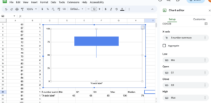
- Select cells C22 through G23, then click Insert and then Chart. From the Chart type dropdown, select candlestick, which is the sixth option in the other category.
- Note the box plot is vertical. You can change the Chart Title or delete it. You should see the label you typed in for your horizontal axis, which you can delete or change by modifying the cell in the sheet.
Step [latex]3[/latex]: Analyze the data representations
Analyzing the graphical representation of the data, we can see that, even though several students did well on the test, the mean seems to have been pulled to the left of center by the [latex]4[/latex] failing scores. The teacher can use all of these representations — the list of scores, the table, and the graphs — to make decisions about possible adjustments to her learning environment.
Data Exploration: Employee Salaries
Salary data from two companies is presented below, Company A and Company B, both in the same field and geographic region. We want to compare the salaries by looking at graphical representations of the data.
Salaried Employees: Company A
| [latex]68340[/latex] | [latex]87282[/latex] | [latex]103802[/latex] | [latex]128863[/latex] | [latex]140085[/latex] | [latex]162300[/latex] | [latex]177109[/latex] |
| [latex]70138[/latex] | [latex]90553[/latex] | [latex]106562[/latex] | [latex]128933[/latex] | [latex]147419[/latex] | [latex]168676[/latex] | [latex]180174[/latex] |
| [latex]71417[/latex] | [latex]95226[/latex] | [latex]120701[/latex] | [latex]130780[/latex] | [latex]149514[/latex] | [latex]169409[/latex] | [latex]180221[/latex] |
| [latex]71867[/latex] | [latex]97042[/latex] | [latex]123313[/latex] | [latex]136204[/latex] | [latex]152008[/latex] | [latex]170031[/latex] | [latex]185837[/latex] |
| [latex]84675[/latex] | [latex]100531[/latex] | [latex]125614[/latex] | [latex]138920[/latex] | [latex]155032[/latex] | [latex]175118[/latex] | [latex]189320[/latex] |
Salaried Employees: Company B
| [latex]35472[/latex] | [latex]43467[/latex] | [latex]53624[/latex] | [latex]65096[/latex] | [latex]72290[/latex] | [latex]110351[/latex] | [latex]124732[/latex] |
| [latex]36983[/latex] | [latex]46652[/latex] | [latex]57946[/latex] | [latex]66235[/latex] | [latex]75279[/latex] | [latex]117574[/latex] | [latex]228920[/latex] |
| [latex]38382[/latex] | [latex]49655[/latex] | [latex]59096[/latex] | [latex]69721[/latex] | [latex]107368[/latex] | [latex]118810[/latex] | [latex]245427[/latex] |
| [latex]41674[/latex] | [latex]53231[/latex] | [latex]59709[/latex] | [latex]71289[/latex] | [latex]108236[/latex] | [latex]119112[/latex] | [latex]275024[/latex] |
| [latex]43256[/latex] | [latex]53506[/latex] | [latex]61724[/latex] | [latex]72211[/latex] | [latex]109472[/latex] | [latex]124678[/latex] | [latex]293012[/latex] |
Hands-on Spreadsheet: Explore the Data
The examples shown below will use Google Sheets but you can also use the Microsoft Excel spreadsheet or an open-source spreadsheet such as Apache OpenOffice Calc.
Step [latex]1[/latex]: Store the data
- Type or copy the data into a new spreadsheet. Title the tab Employee Salaries. Place the columns of data side by side in column A and column B.
- Obtain descriptive statistics for each company’s data.
- Analyze the descriptive statistics and compare the companies’ data.

Step [latex]2[/latex]: Create a box and whisker plot with both data series on the same graph
- Format your statistics such that you have a subset with the row of the labels Employee Set, Min, Q[latex]1[/latex], Q[latex]3[/latex], and Median. Beneath that row, you should have a row for Salaried employees A with the relevant data and then another row below that for Salaried employees B with its relevant data. Select this subset of data.
- Click on Insert then Chart, then choose the Candlestick chart from the Chart type dropdown. You should see both sets of data appear as parallel box plots on the graph in different colors. If not, check that “Switch rows / columns” is not selected.
- Select to use row [latex]1[/latex] as headers. The data column labels should appear at the top under the Chart Title. You can now delete the Chart Title in the Customize section.
Step [latex]3[/latex]. Create a scatter plot with both data series on the same graph
- Select the two columns of raw data and insert a new chart, this time choose scatter plot. Make sure that there are two series, one for each of the sets of salaried employees.
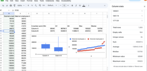
Figure 9. Create a scatter plot with both data series on the same graph
Step [latex]4[/latex]: Analyze the data
As we saw in the descriptive statistics, Company A has a tighter distribution of salaries about its center. Company B possesses extremes at both ends of salary range. The salaries in B are persistently and substantially lower than A’s are with the notable exception of four outliers at the top end. These are pulling the mean of B far to the right of the median. With B’s median salary at [latex]$69,721[/latex] and A’s at [latex]$130,780[/latex], it is clear that the salary distribution at company A is more equitable than at company B. A has the higher starting salary, and higher salaries overall than all but the four outliers at company B.