- Analyze heat maps to draw meaningful conclusions from visualized data
- Analyze motion bubble charts to identify trends and patterns in data over time
- Identify potential issues and challenges when analyzing large and volatile data sets
Heat Maps
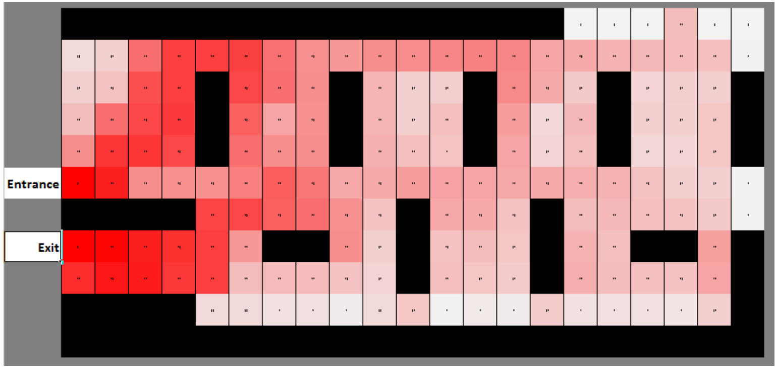
Heat maps are a type of data visualization tool that are commonly used to represent data in a graphical format. Heat maps use color coding to represent the intensity of data values across different categories. By analyzing heat maps, individuals can draw meaningful conclusions about the patterns and trends present in the data.
To effectively analyze heat maps, it is important to understand the key components of this type of visualization. Heat maps typically feature a color gradient that represents the range of values being visualized. The darker colors on the map represent higher values, while lighter colors represent lower values. The color gradient used in heat maps can be customized to suit different data sets and highlight specific trends or patterns.
heat maps
Heat maps are a type of data visualization that use color coding to represent the intensity of data values across different categories.
The darker colors on the heat map represent higher values, while lighter colors represent lower values.
One key strategy for analyzing heat maps is to identify any trends or patterns in the data. This might involve looking for areas of the map that are consistently darker or lighter, or examining how the colors shift across different categories. By identifying these trends, individuals can gain insight into the underlying patterns and relationships present in the data.
Another strategy for analyzing heat maps is to compare different variables or categories. This might involve comparing the values represented in two different heat maps, or examining how the colors change when the data is broken down into different subcategories. By comparing different variables, individuals can gain a more nuanced understanding of how different factors contribute to the overall patterns present in the data.
It is also important to consider the limitations of heat maps when analyzing them. Heat maps can be a powerful tool for visualizing data, but they may not always provide a complete or accurate representation of the underlying trends. For example, heat maps may be biased towards certain types of data or may not account for outliers in the data. To avoid drawing inaccurate conclusions, it is important to critically evaluate the data and consider any potential sources of bias or error.