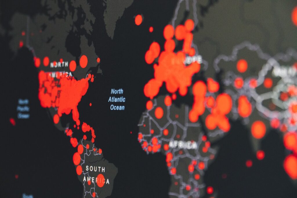
- Analyze heat maps to draw meaningful conclusions from visualized data
- Analyze motion bubble charts to identify trends and patterns in data over time
- Identify potential issues and challenges when analyzing large and volatile data sets
A Picture Is Worth a Thousand Words
The purpose of any graphical displays (including heat maps) is to utilize such displays and use it to infer the type of data set used in the display, the data source, and to identify the scale and colors used to represent the data. To obtained a meaningful inference about the data set, it is important to recognize an accurate interpretation of the display and able to write a statement about interpreting it.
Complex Graphical Displays
Graphical displays are useful for presenting a large amount of complex data in a compact and digestible form. The media uses graphs regularly to present information about topical situations. But it takes time and a critical eye to correctly interpret a display presented in the media. A display may be unintentionally misleading or even designed to misrepresent the true nature of the data.