For questions 1-6, you will be using a New York Times graphical display called “Racial Diversity by Neighborhood.”[1]
Please access the graphical display through the following link:
https://www.nytimes.com/2020/01/30/learning/whats-going-on-in-this-graph-racial-divers ity-by-neighborhood.html.
- What do you notice from the graphical display?
- What do you wonder from the graphical display?
- What might be the purpose or intention of this graphical display?
- From 1980 to 2017, describe how the diversity of neighborhoods changed.
- If the graph was recreated using data from the 2020 U.S. Census, what do you think the new graph would show regarding diversity in our neighborhoods?
- How do you define diversity? Would you want to add/remove anything from the graphical display?
For questions 7-8, use the following graphical display[2] to answer the questions. You can interact with the graph at:
https://public.tableau.com/views/Gender_Inequality_Index/GenderInequalityIndex?:showVizHome=no
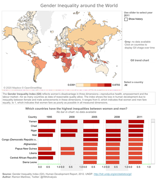
- Describe the story you are getting from the graphical display in a few sentences.
- How would you rate the graphical display on the following seven criteria (very evident, evident but could be improved, or not evident)? Provide one or two sentences of support for each rating.
- Part A: Design
- Part B: Precision
- Part C: Efficiency
- Part D: Use of time
- Part E: Use of color
- Part F: Use of space
- The Learning Network. (2020, February 28). What’s going on in this graph | Racial diversity by neighborhood. The New York Times. https://www.nytimes.com/2020/01/30/learning/whats-going-on-in-this-graph-racial-diversity-by-neighborhood.html ↵
- Martinez, R. (2012). Gender inequality around the world. Health Intelligence. https://public.tableau.com/views/Gender_Inequality_Index/GenderInequalityIndex?:embed=y&:showVizHome=no ↵