- Detect misleading or incorrect graphical displays
- Enhance written analyses of graphs
Identifying Misleading and Erroneous Graphical Displays
Graphical displays serve as a cornerstone in the realm of data analysis. They offer a visual representation that can make complex data more understandable. The human brain is wired to process visual information more efficiently than textual data, making graphs and charts invaluable tools for quick comprehension and insightful analysis. They act as a bridge between raw data and human understanding, translating numbers into visual patterns that can be easily interpreted.
In a world awash with data, the ability to critically evaluate graphical displays is not just a skill but a necessity. Graphs and charts are powerful tools for conveying complex information quickly, but they can also be manipulated to deceive or mislead.
Initial Checks: Examining Axes and Labels for Graph Integrity
To determine whether a graph is misleading or deceptive, start by scrutinizing its foundational elements like units, axes, and labels. This initial examination can provide valuable clues about the graph’s integrity and is a crucial step before delving into the various types of misleading graphs you may encounter.
| Type | Definition | Example | Connection | Pro Tip |
|---|---|---|---|---|
| Clarity of Units | Check if the units are clearly stated on the graph. | A graph showing temperature changes without specifying if it’s in Fahrenheit or Celsius. | In scientific research or international collaborations, unclear units can lead to significant errors. | Always check for units. If they’re missing, be cautious about drawing conclusions from the graph. |
| Label Accuracy | Labels should accurately describe the data they represent. | A political poll graph using a vague label like “Favorable Opinion.” | Ambiguous labels can be used in political polls to sway public opinion. | Scrutinize the labels. If they’re unclear or ambiguous, the graph might be trying to mislead you. |
| Consistency in Axes | Check if the axes are consistent in their scaling, either linear or logarithmic. | An economic growth graph switching from a linear to a logarithmic scale halfway through. | In graphs related to economic growth or the spread of diseases, inconsistent scaling can distort the data’s true meaning. | Always note the type of scale used on the axes. Inconsistent or inappropriate scaling can distort the data’s true meaning. |
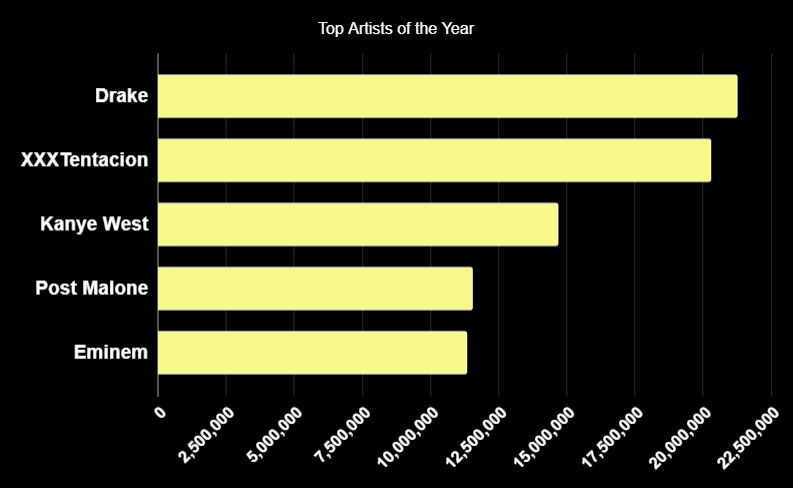
An initial look at the graph below would lead someone to believe Drake was the top artist by a landslide, but if you look closer at the graph you can see the bars of the graphs do not have clearly defined units or scale. How do you think this graph would look with defined units and scale? How do you think the bars of the graph will change?

By paying close attention to axes and labels, you arm yourself with another layer of scrutiny to apply when interpreting graphical data. This attention to detail can help you navigate the sea of information in today’s data-rich environment.
- https://genius.com/ ↵