- The table below shows scores on a Math test.
- Complete the frequency table for the Math test scores
- Construct a histogram of the data
- Construct a pie chart of the data
[latex]80[/latex] [latex]50[/latex] [latex]50[/latex] [latex]90[/latex] [latex]70[/latex] [latex]70[/latex] [latex]100[/latex] [latex]60[/latex] [latex]70[/latex] [latex]80[/latex] [latex]70[/latex] [latex]50[/latex] [latex]90[/latex] [latex]100[/latex] [latex]80[/latex] [latex]70[/latex] [latex]30[/latex] [latex]80[/latex] [latex]80[/latex] [latex]70[/latex] [latex]100[/latex] [latex]60[/latex] [latex]60[/latex] [latex]50[/latex]
- A group of adults where asked how many cars they had in their household
- Complete the frequency table for the car number data
- Construct a histogram of the data
- Construct a pie chart of the data
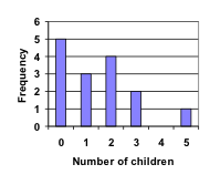
[latex]1[/latex] [latex]4[/latex] [latex]2[/latex] [latex]2[/latex] [latex]1[/latex] [latex]2[/latex] [latex]3[/latex] [latex]3[/latex] [latex]1[/latex] [latex]4[/latex] [latex]2[/latex] [latex]2[/latex] [latex]1[/latex] [latex]2[/latex] [latex]1[/latex] [latex]3[/latex] [latex]2[/latex] [latex]2[/latex] [latex]1[/latex] [latex]2[/latex] [latex]1[/latex] [latex]1[/latex] [latex]1[/latex] [latex]2[/latex] - A group of adults were asked how many children they have in their families. The bar graph to the right shows the number of adults who indicated each number of children.
- How many adults where questioned?
- What percentage of the adults questioned had [latex]0[/latex] children?
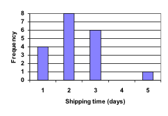
- Jasmine was interested in how many days it would take an order from Netflix to arrive at her door. The graph below shows the data she collected.
- How many movies did she order?
- What percentage of the movies arrived in one day?
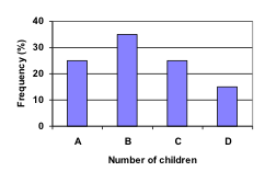
- The bar graph below shows the percentage of students who received each letter grade on their last English paper. The class contains [latex]20[/latex] students. What number of students earned an A on their paper?
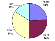
- Kori categorized her spending for this month into four categories: Rent, Food, Fun, and Other. The percents she spent in each category are pictured here. If she spent a total of [latex]$2600[/latex] this month, how much did she spend on rent?
- A group of diners were asked how much they would pay for a meal. Their responses were: [latex]$7.50, $8.25, $9.00, $8.00, $7.25, $7.50, $8.00, $7.00[/latex].
- Find the mean
- Find the median
- Write the [latex]5[/latex]-number summary for this data
- You recorded the time in seconds it took for [latex]8[/latex] participants to solve a puzzle. The times were: [latex]15.2, 18.8, 19.3, 19.7, 20.2, 21.8, 22.1, 29.4[/latex].
- Find the mean
- Find the median
- Write the [latex]5[/latex]-number summary for this data
- Refer back to the histogram from question #[latex]3[/latex].
- Compute the mean number of children for the group surveyed
- Compute the median number of children for the group surveyed
- Write the [latex]5[/latex]-number summary for this data
- Create box plot
- Refer back to the histogram from question #[latex]4[/latex].
- Computer the mean number of shipping days
- Compute the median number of shipping days
- Write the [latex]5[/latex]-number summary for this data
- Create box plot
- The box plot below shows salaries for Actuaries and CPAs. Kendra makes the median salary for an Actuary. Kelsey makes the first quartile salary for a CPA. Who makes more money? How much more?
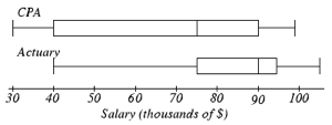
- Referring to the boxplot above, what percentage of actuaries makes more than the median salary of a CPA?
- Families of children at a middle school were asked how often they eat out in a week. Their answers are [latex]2, 5, 1, 4, 2, 1, 3, 2, 1, 5, 3, 7, 1, 1, 4, 3.[/latex].
- What is the mean?
- What is the median?
- What is the mode?
- construct a dot plot of the data.
- A group of adults at the dentist were asked how many cavities they had last year. Their answers are [latex]1, 1, 1, 3, 1, 5, 1, 2, 1, 1, 3, 1[/latex]
- What is the mean?
- What is the median?
- What is the mode?
- construct a dot plot of the data.
- The ages of cars in years in a company parking lot is listed below.
[latex]12, 15, 10, 12, 8, 6, 4, 1, 1, 20, 13, 17, 9, 8, 5, 5, 6, 5, 6, 2, 3, 1, 22, 12, 15, 9, 6, 2, 3[/latex]
- (a) What is the mean?
- What is the median?
- What is the mode?
- Construct a dot plot.
- What is the [latex]5[/latex] number summary?
- Construct a box plot.
- The number of days between thunderstorms in the summer one particular year is given below.
[latex]1, 4, 1, 7, 3, 2, 5, 2, 9, 1, 3, 7, 4, 1, 2, 5, 10, 5, 1[/latex]
- What is the mean?
- What is the median?
- What is the mode?
- Construct a histogram.
- The price of a shampoo, cut, and blow dry at [latex]10[/latex] area salons are listed below.
[latex]28, 35, 45, 25, 32, 60, 18, 27, 35, 42, 27[/latex]
- What is the mean?
- What is the median?
- What is the mode?
- Construct a histogram.
For each of the following data sets, find the mean, median, standard deviation, range, and skewness. Construct a visual or graphical representation that you think best represents an interesting characteristic of the data.
- The heights of [latex]24[/latex] women in inches are
[latex]56, 58, 58, 60, 60, 60, 61,62, 62, 62, 62, 63, 63, 63, 63, 63, 64, 64, 64, 66, 68, 69, 70, 72[/latex].
- The shoe sizes (U.S.) of [latex]15[/latex] men are
[latex]6, 8, 8.5, 9.5, 9.5, 10, 10, 10.5, 10.5, 10.5, 11, 11, 11.5, 13, 14[/latex]
- The grades on a recent chemistry exam are
[latex]48, 59, 60, 65, 66, 67, 68, 69, 70, 71, 72, 73, 73, 74, 75, 75, 76, 78, 78, 79, 80, 82, 85, 85, 86, 89, 91, 91, 92, 95, 97, 99[/latex]
- The annual salaries of [latex]10[/latex] actors living in Los Angeles are
[latex]12\text{k}, 18\text{k}, 26\text{k}, 30\text{k}, 31\text{k}, 37\text{k}, 38\text{k}, 49\text{k}, 87\text{k}, 126\text{k}[/latex]
Note: The letter “k” is commonly used as an abbreviation for “thousand,” often in reference to financial amounts, where [latex]10\text{k}[/latex] would represent [latex]10,000[/latex].
The following data set include two sets of data to compare. For each, get the descriptive statistics of each, then plot them side by side in a scatterplot and a box plot. Discuss central tendency and spread and how the data compares between the two sets.
- The average ages of the consumers of a certain product before and after a marketing campaign are
Before: [latex]33, 45, 27, 35, 37, 52, 55, 57, 48, 42, 27, 23, 36, 34, 35, 39, 42, 41, 40 ,35, 33[/latex]
After: [latex]19, 22, 27, 33, 28, 18, 26, 25, 27, 35, 55, 57, 42, 35, 33, 32, 25, 27, 29, 30, 27[/latex]
Use a spreadsheet and statistical tools to perform descriptive statistics on the following problems.
- The World Jigsaw Puzzle Championship is celebrated each September at the Millennium Dome in Valladolid, Spain. A list of final times for completing a [latex]500[/latex] piece puzzle by individual competitors competing in the [latex]2019[/latex] world championship can be found in the file linked here or at the top of the page: Jigsaw Times.
- Use the Data Analysis tool in Excel to find the mean and median of the set. What can you say about the central tendencies and symmetry of the data according to the descriptive statics?
- Perform a Frequency Table and Histogram of the data. Do these representations support what you concluded about the shaper and center of the data based on the descriptive statistics? Do you notice anything different now that you have a visual representation?
- Are U.S. Presidents being elected at different ages now than they used to be? Are they living longer? The ages at inauguration and ages at death for the first [latex]41[/latex] presidents (except #[latex]39[/latex], Jimmy Carter, who (was still living at the time this was written) can be found in the file linked here or at the top of the page: U.S. Presidents file. Chart them side by side as parallel box plots and parallel scatter plots to look for trends.
- What trends do you notice comparing the charts? Discuss mean age for each column, range, and standard deviation.
- What was the youngest age at which a president was inaugurated? The oldest?
- What was the youngest age at which a president died? The oldest?