Identifying Misleading and Erroneous Graphical Displays Cont.
Types of Misleading Graphs
Now that you’re equipped with the knowledge to scrutinize the finer details of axes and labels, let’s delve into some of the more overt tactics that can make a graph misleading.
There are various ways a graph can be misleading. For instance, the scale might be manipulated to exaggerate differences, or data points might be selectively omitted to support a particular narrative. Understanding these tactics is the first step in becoming a savvy consumer of data.
| Type | Definition | Example | Real-World Connection | Pro Tip |
|---|---|---|---|---|
| Manipulated Scale | Changing the scale on the axes to exaggerate differences. | A line graph might show a stock price rising dramatically, but upon closer inspection, the [latex]y[/latex]-axis starts at [latex]$99[/latex] and ends at [latex]$101[/latex], making a [latex]$2[/latex] difference look enormous. | Often used in financial news to create hype around a stock or make economic changes seem more significant. | Always check the scale of the graph. |
| Selective Omission of Data | Showing only specific data points to paint a biased picture. | A graph might show only the positive outcomes of a particular treatment painting an overly optimistic picture. | Common in pharmaceutical ads or political campaigns where only favorable data is presented. | Be wary of graphs that seem too good to be true. |
| Cherry-Picking Time Frames | Using specific time frames to create a misleading impression of performance. | A graph highlights the performance of an investment fund over its best quarter. | Often in investment brochures or sports stats to show a player’s or fund’s peak performance. | Always consider the time frame. |
| Misleading Visual Elements | Using visual tricks to emphasize points that aren’t necessarily significant. | A 3D pie chart uses bright colors and disproportionate sizes to mislead or emphasize a point that might not be significant when looked at objectively. | Used in marketing campaigns to make products seem more appealing than they are. | Look beyond the visual gimmicks. |
Understanding these tactics and being vigilant can make you a savvy consumer of data. It empowers you to question the information presented to you, making you less susceptible to manipulation.
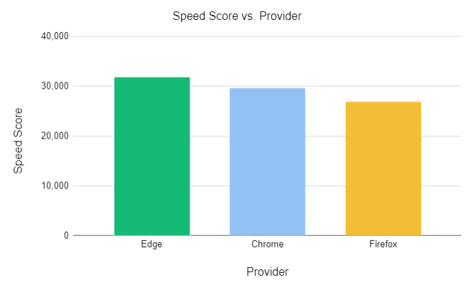
In the graph below, Microsoft, who was trying to create a conceptual design, created a misleading graphic.
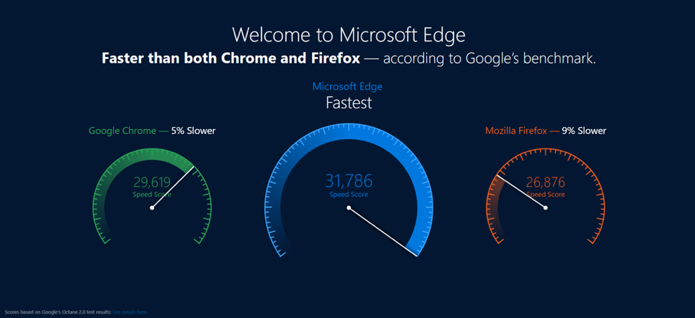
The graphic leads consumers to believe Microsoft Edge is [latex]25\%[/latex] faster than Chrome and [latex]50\%[/latex] faster than Firefox. While Microsoft Edge is slightly faster than Chrome and Firefox, it is not that significantly faster.
A column chart would have been a more accurate representation of the data.