Create a graph that displays key information from quantitative data
Explain the differences between different graphs that display the same quantitative data
Exploring Movie Runtimes
Figure 1. Exploring movie data—like runtimes—can reveal trends about what we love to watch and how long we’re willing to stay tuned in.For the following question, download the data set “Movie Runtime” and then copy and paste the values into the statistical tool.
Use the Describing and Exploring Quantitative Variables tool to create a histogram for the distribution of runtime of the top 100 highly rated movies as ranked by Rotten Tomatoes.
STEP 1: Select the “Single Group” tab at the top of the screen.
STEP 2: Locate the dropdown under “Enter Data” and select “Your Own.”
STEP 3: For “Do you have” select “Individual Observations.”
STEP 4: In the “Name of Variable” box, type “Movie Runtime”.
STEP 5: Download the Movie Runtime spreadsheet and copy and paste the data in the ‘runtime’ column.
STEP 6: Locate “Choose Type of Plot” and choose “Histogram.” Unselect any other types.
STEP 7: Under “Select Binwidth For Histogram”, choose “10”.
STEP 8: Locate “Choose Type of Plot” and choose “Dotplot.” Unselect any other types.
STEP 9: Under “Select Binwidth For Dotplot”, slide to “5”.
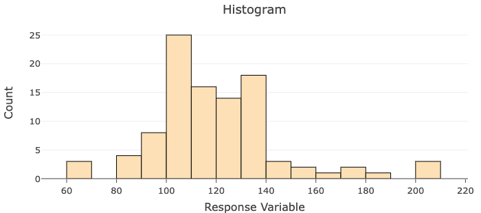
Histogram with a binwidth of [latex]10[/latex]
Figure 2. With a bin width of 10, this histogram helps visualize the frequency and spread of the dataset’s values, making it easier to spot patterns.
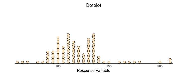
Dotplot with a binwidth of [latex]5[/latex]
Figure 3. This dotplot provides a detailed look at the spread and frequency of individual data points, highlighting patterns in the distribution.