So Beth’s performance on homework varies, but on average, she makes an [latex]84[/latex] on each assignment. In other words, we can understand the mean as the score Beth would have on every assignment if she always made the same grade – that is, if she made an [latex]84[/latex] on all nine homework assignments.
From this viewpoint, the mean is the fair share measure of center.
Notice, however, that Beth did not actually make an [latex]84[/latex] on any assignment. The mean does not give us information about any individual homework score or about how the homework scores vary. It only gives us a sense of her performance by averaging the values across all the assignments.
Here is the mean marked on a dotplot of the distribution of homework scores. For this set of scores, the mean appears to be a pretty good measure of how Beth performed overall.
Figure 1. A dot plot of homework scores with a blue line showing the mean score of 84
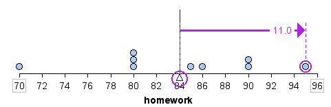
The mean is also referred to as the balancing point of a distribution. If we measure the distance between each data point and the mean, the distances are balanced on each side of the mean.
For example, a homework score of [latex]95[/latex] is [latex]11[/latex] points above the mean, as shown.
Figure 2. A homework score of 95 is 11 points above the mean score of 84.
A homework score of [latex]80[/latex] is [latex]4[/latex] points below the mean. In the table, we calculate the sum of the distances above and below the mean. Notice that the sum of the distances above and below the mean are equal. In this way, the mean is a balancing point for the distribution.
Figure 3. Table showing the distances of homework scores from the mean (84); total distances below and above the mean are both 26, illustrating balance around the mean.
We can also view the distances below the mean as negative and the distances above the mean as positive. When we add these “signed” distances together, we get [latex]0[/latex]:
The mean is the only measure of center with this special property.
b) Calculate the median of the data set.
The median score is [latex]85[/latex].
[latex]85[/latex] is the center score. There are four homework scores below [latex]85[/latex] and four homework scores above [latex]85[/latex].
For this data set, the median was one of the homework scores. This will not always be the case. So, like the mean, the median does not give us information about any individual homework score or about how the homework scores vary. It only gives us a sense of Beth’s performance by locating a value that is the middle of the actual scores.
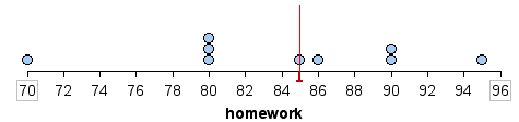
Here is the median marked on a dotplot of the distribution of homework scores. For this set of scores, the median is also a pretty good measure of how Beth performed overall.
Figure 4. A dot plot showing homework scores with the median marked by a red line at 84.
Mode
Another measure of the center is the mode. The mode is the most frequent value. There can be more than one mode in a data set as long as those values have the same frequency and that frequency is the highest. A data set with two modes is called bimodal.
Statistics exam scores for 2020 students are as follows:
Based on the frequency table, the most frequent score is [latex]72[/latex], which occurs five times. Therefore, mode = [latex]72[/latex].
When is the mode the best measure of the “center?”
In certain real-world context, mode might be a more appealing measure of “center.” For example, consider a weight loss program that advertises a mean weight loss of six pounds the first week of the program. The mode might indicate that most people lose two pounds the first week, making the program less appealing.
The mode can be calculated for qualitative data as well as for quantitative data. For example, if the data set is: red, red, red, green, green, yellow, purple, black, and blue, the mode is red.
Calculating the Mean of Grouped Frequency Tables
When only grouped data is available, you do not know the individual data values. (We only know intervals and interval frequencies.) Therefore, you cannot compute an exact mean for the data set. What we must do is estimate the actual mean by calculating the mean of a frequency table. A frequency table is a data representation in which grouped data is displayed along with the corresponding frequencies.
To calculate the mean from a grouped frequency table, we can apply the basic definition of mean:
[latex]\displaystyle\text{mean}=\frac{{\text{data sum}}}{{\text{number of data values}}}[/latex].
We simply need to modify the definition to fit within the restrictions of a frequency table.
Since we do not know the individual data values, we can instead find the midpoint of each interval.
We can now modify the mean definition to be [latex]\displaystyle\text{Mean of Frequency Table} = \frac{\sum\nolimits{fm}}{\sum\nolimits{f}}[/latex] where [latex]f[/latex] = the frequency of the interval and [latex]m[/latex] = the midpoint of the interval.
A frequency table displaying Professor Blount’s last Statistics test is shown. Find the best estimate of the class mean.
Grade Interval
Number of Students
[latex]50–56.5[/latex]
[latex]1[/latex]
[latex]56.5–62.5[/latex]
[latex]0[/latex]
[latex]62.5–68.5[/latex]
[latex]4[/latex]
[latex]68.5–74.5[/latex]
[latex]4[/latex]
[latex]74.5–80.5[/latex]
[latex]2[/latex]
[latex]80.5–86.5[/latex]
[latex]3[/latex]
[latex]86.5–92.5[/latex]
[latex]4[/latex]
[latex]92.5–98.5[/latex]
[latex]1[/latex]
Find the midpoints for all intervals.
Grade Interval
Midpoint
Number of Students
[latex]50–56.5[/latex]
[latex]53.25[/latex]
[latex]1[/latex]
[latex]56.5–62.5[/latex]
[latex]59.5[/latex]
[latex]0[/latex]
[latex]62.5–68.5[/latex]
[latex]65.5[/latex]
[latex]4[/latex]
[latex]68.5–74.5[/latex]
[latex]71.5[/latex]
[latex]4[/latex]
[latex]74.5–80.5[/latex]
[latex]77.5[/latex]
[latex]2[/latex]
[latex]80.5–86.5[/latex]
[latex]83.5[/latex]
[latex]3[/latex]
[latex]86.5–92.5[/latex]
[latex]89.5[/latex]
[latex]4[/latex]
[latex]92.5–98.5[/latex]
[latex]95.5[/latex]
[latex]1[/latex]
Calculate the sum of the product of each interval frequency and midpoint. [latex]\sum\nolimits{fm}[/latex]