- Describe the graph of a data set using its shape, center, spread, and outliers
Shape, Center, and Spread
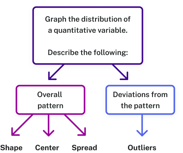
When the observations of a quantitative variable are displayed in a graph, we call the display the distribution of a quantitative variable. We display the distribution to read information about the dataset from its graph. The first three characteristics of the distribution are shape, center, and spread.
The Main Idea
Shape: Is the data symmetrically distributed, or does it “bunch up” on one side or the other?
- If the majority of the data lies to the left with a long tail of lower values to the right, we say it is right-skewed.
- If the majority of the data lies to the right with a long tail of lower values to the left, we say it is left-skewed.
- If the data is centered and falls out evenly on both sides, we say it is symmetric.
- Unimodal data has one mound (cluster) of data. Bimodal has two mounds of data. Multimodal has more than two mounds of data.
Center: Where does the center of the data appear to be? Center can be measured as the median or the mean of the dataset. When looking at the distribution, you should consider where the heaviest “weight” of the data lies.
Spread: The spread of a data distribution measures the range of the data (from least to greatest, found by subtracting the smallest value from the largest). Spread is also concerned with gaps in the data and with outliers, which are rare values far to the left (lower outliers) or to the right (upper outliers) of the bulk of the data. Outliers extend the range beyond what the bulk of the data indicates it should be. Extreme outliers can affect the mean of the dataset, pulling it in the direction of the outlier.
The following video will help you visually examine a quantitative data distribution for shape, center, spread, and the presence of outliers.
[Trouble viewing? Click to open in a new tab.]
Distribution of a Quantitative Variable
When we describe patterns in data, we use descriptions of shape, center, and spread. We also describe exceptions to the pattern. We call these exceptions outliers.