Distribution of Quantitative Variables: Apply It 1

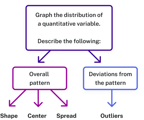
  • Describe the graph of a data set using its shape, center, spread, and outliers

The Distribution of Course Evaluation Scores

Photo of a person gesturing towards a whiteboard.
Figure 1. Course evaluations help instructors reflect on their teaching and make improvements based on student feedback.

At the end of a course in higher education, students might have an opportunity to evaluate the course and the instructor. This evaluation is called a course evaluation. A course evaluation can be a paper or electronic questionnaire. Typically, a course evaluation is not mandatory, but recommended. Collecting data using a course evaluation is a way to collect feedback, which the instructor and school can use to assess the quality of instruction and make targeted changes.

When we describe patterns in data, we use descriptions of shape, center, and spread. We also describe exceptions to the pattern. We call these exceptions outliers.

Flow chart with three levels. The first level is "Graph the distribution of a quantitiative variable" which points to two different boxes on the second level, "Overall pattern" and "Deviations from the pattern". Overall pattern points to three options, "Shape", "Center", and "Spread." "Deviations from the pattern" points to one option, "Outliers."
Figure 2. When analyzing a graph, describe the overall pattern (shape, center, spread) and look for deviations, or outliers, that don’t follow the pattern.

Let’s consider the statistical question: In general, what percentage of students complete course evaluations?

The Teaching Evaluation data set contains information collected from student evaluations for a sample of [latex]463[/latex] courses taught by [latex]94[/latex] professors at The University of Texas at Austin.

[Trouble viewing? Click to open in a new tab.]

Choose Your Own Dataset

For this problem, you'll create a histogram and describe its distribution for a variable of your choosing from the Teaching Evaluation data set.