Figure 1. Visuals in media can shape public opinion, so it’s important to evaluate whether charts and graphs are accurate and clear.
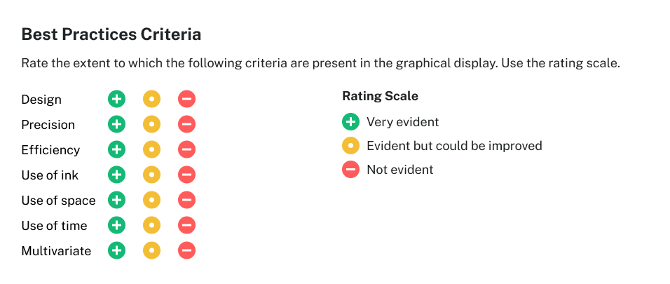
List the criteria for effective visualization: design, precision, efficiency, use of time, use of ink, use of space, and multivariate.
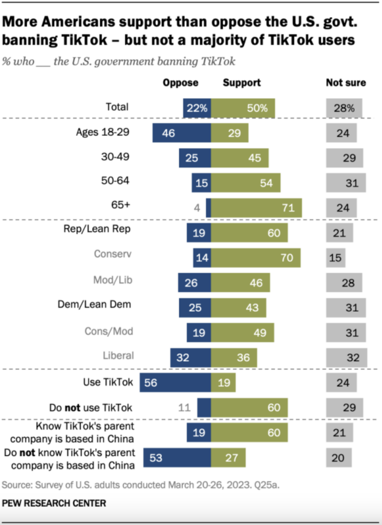
The following graphical display provides the visualization of Americans who support the U.S. government banning TikTok[1].
Figure 2. This chart shows that while half of U.S. adults support a government ban on TikTok, support varies widely by age, political affiliation, TikTok usage, and awareness of its ownership.
Evaluate this graphical display by answering these questions.
Is this graph clear in communicating patterns/trends?
What are we supposed to be comparing in this graph?
What do the different colors represent?
What is the scale for the bar chart?
The answers to some of these questions are not clear.
In particular, to match the title of the graph, the bar representing “support” should be on the left and “oppose” on the right. The media like to provide supporting arguments (pros) first before the opposing arguments (cons).
Additionally, the colors selected didn’t have meaning. Typically, both green and blue (cold color palette) are mostly used to represent “support”, while “oppose” is typically represented by a warmer color palette.
The title of this graph may be misleading and doesn’t represent the whole graphical display. This is because, as we look more closely into the graphic, we find that older Americans are much more supportive of banning the platform than younger ones. Some of these age differences are related to the use of TikTok. Users of the platform are less supportive of banning it than non-users. Additionally, the opinion of banning TikTok also differs within each political party.
To critique a graphical display, it might be easier to rate the extent to which each of the criteria on the list for effective visualization is present in the graphical display. You may use the rating scale seen below.
Figure 3. Use this checklist to help evaluate the effectiveness of a graphical display based on key criteria such as design, efficiency, and precision.
Do not forget to write a conclusion to describe your evaluation of the graphical display.
Choose Your Own Dataset
For this problem, you'll use the rating scale to review an infographic of your choosing.