Describe the differences in variability in histograms and dotplots.
Calculate and describe standard deviation.
We have learned that the shape and measures of center are important characteristics to describe a data set.
Another important characteristic of any data set is the variation within the data. In some data sets, the data values are concentrated closely near the center; in other data sets, the data values are more widely spread out from the center. So, another way to describe data numerically is to find and use the measures of spread.
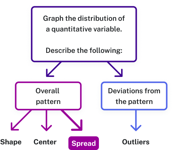
Figure 1. When analyzing a graph, describe the overall pattern (shape, center, spread) and look for deviations, or outliers, that don’t follow the pattern.
variability
Variability in statistics refers to a measure of how spread out, or dispersed, the data set is.
Standard deviation, variance, and range are all calculated measures of variability.
Comparing Variability
We can visually assess variability using graphical displays such as histograms and dotplots. When looking at a histogram or a dotplot, consider whether the data appears to be more spread out from the center (greater variability), or more clustered toward the center (less variability). These visual clues help us recognize distributions that have more or less variability than others.
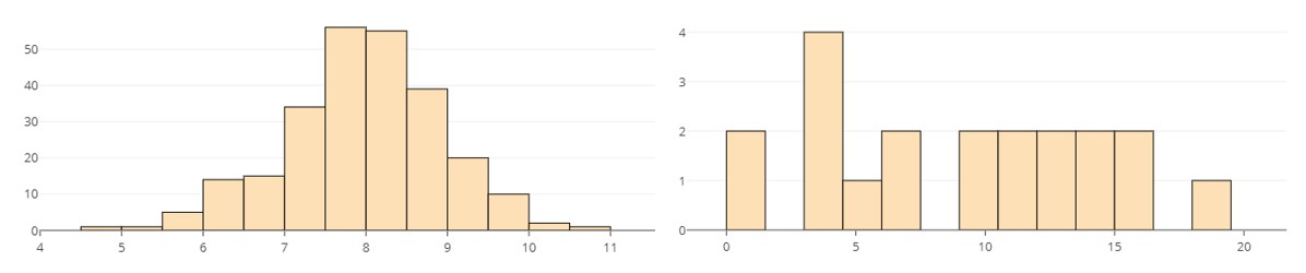
Histograms displaying the distribution of two quantitative variables with different amounts of variability are shown below. Which do you think has less variability than the other? Explain your reasoning. For example: What visual clue could help you decide if your answers were correct?
Figure 2. These two histograms show distributions with different amounts of variability, illustrating how data sets can differ in how spread out their values are.
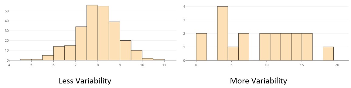
The data in the distribution on the left varies less than that of the one on the right. Note how the data in the first histogram is tightly clustered around the center and tails off quickly to either side. The data in the second histogram is widely dispersed across the graph.
Figure 3. The left histogram shows data with less variability—most values are close to the center. The right histogram shows more variability, with data spread out more widely across different values.
The visual indication of variability is how tightly clustered or widely dispersed the data appears in the display.
It can be easier to visualize variability using a dotplot instead of a histogram because the individual data points (or observations) are visible in the dotplot.
Range
Range is a value that can describe the spread of the data set. When the range is larger, it indicates more variability in the data. However, range only utilizes two observations in the entire data set to measure variability, so it is not an ideal measure of spread when used alone.
range
Range = maximum value – minimum value = largest value – smallest value
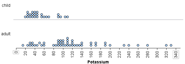
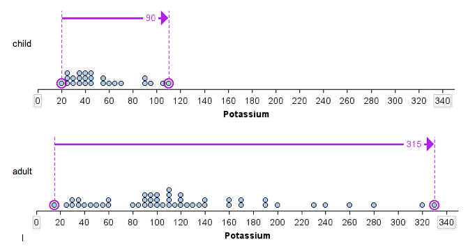
The following dotplots show the potassium content in 76 cereals. Compare children’s cereals to adult cereals.
Figure 4. A dotplot of the potassium content in 76 cereals, sorted by adult and children’s cereals.
We see that there is more variability in the potassium content of the adult cereals than in the children’s cereals.
We can also measure this spread using range.
The range of potassium content is larger for the adult cereals than for the children’s cereals. The children’s cereal set has a range of [latex]90[/latex] (because [latex]110 − 20 = 90[/latex]), whereas the adult cereal set has a range of [latex]315[/latex] (because [latex]330 − 15 = 315[/latex]).
Figure 5. Dot plots comparing potassium content in children’s and adult cereals, with adult cereals showing a wider range of values than children’s cereals.