Read information from a boxplot and make conclusions
Compare boxplots
Additional Example of Five-Number Summary & Outliers
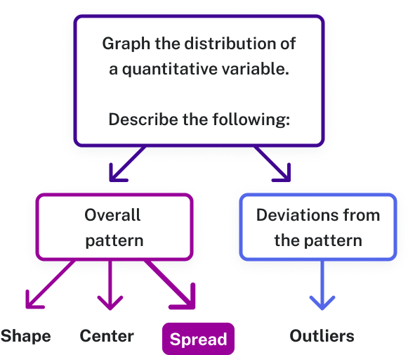
Recall that when we describe the distribution of a quantitative variable, we describe the overall pattern (shape, center, and spread) in the data and deviations from the pattern (outliers).
Figure 1. When analyzing a graph, describe the overall pattern (shape, center, spread) and look for deviations, or outliers, that don’t follow the pattern.Two sets of exam scores
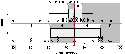
Consider the following two distributions of exam scores:
Figure 2. Two boxplots of exam scores.
Both distributions have a median of approximately [latex]74.5[/latex].
The answer to this question depends on how we measure variability. Both distributions have the same range. The range is the distance spanned by the data. We calculate the range by subtracting the minimum value from the maximum value.
Range = Maximum value – minimum value
For both of these data sets, the range is [latex]55[/latex] (here is how we calculated the range: [latex]95 – 40 = 55[/latex]). If we use the range to measure variability, we say the distributions have the same amount of variability.
But the variability in the distributions differs when we look at how the data is distributed about the median. Class A has a large portion of its data close to the median. This is not true for Class B. From this viewpoint, Class A has less variability about the median.
Therefore, Class B has more variability about the median.
[latex]Q1[/latex], [latex]Q3[/latex], and IQR
Now we can develop a way to measure the variability about the median. To do so, we use quartiles. Quartile marks divide the data set into four groups with equal counts.
To find the first and third quartiles ([latex]Q1[/latex] and [latex]Q3[/latex] respectively), first determine the list of values that lie both above and below the median. Then, take the medians of those lists.
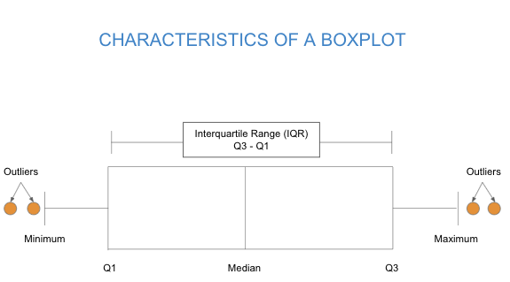
A boxplot is constructed from five values: the minimum value, the first quartile, the median, the third quartile, and the maximum value.
This set of five numbers is called the five-number summary. Figure 3. A boxplot creates a visual summary of a data set using five important values: the minimum, first quartile (Q1), median, third quartile (Q3), and maximum. It also shows the outliers in the data.Two sets of exam scores: Consider the following two distributions of exam scores:
Figure 2. Two boxplots of exam scores.
The quartiles, together with the minimum and maximum score,s give the five-number summary:
Notice: The second quartile mark ([latex]Q2[/latex]) is the median.
Notice: Some quartiles exhibit more variability in the data, even though each quartile contains the same amount of data.
For example, [latex]25[/latex]% of the scores in Class A are between [latex]40[/latex] and [latex]71[/latex]. There is a lot of variability in this first quartile ([latex]Q1[/latex]). The eight scores in [latex]Q1[/latex] vary by [latex]30[/latex] points.
Compare this to the third quartile ([latex]Q3[/latex]) for Class A: [latex]25[/latex]% of the scores in Class A are between [latex]74.5[/latex] and [latex]78.5[/latex]. There is not much variability in [latex]Q3[/latex]. The eight scores in [latex]Q3[/latex] vary by only [latex]4[/latex] points.
How are quartiles used to measure variability about the median? The interquartile range (IQR) is the distance between the first and third quartile marks. The IQR is a measurement of the variability about the median. More specifically, the IQR tells us the range of the middle half of the data.
As we observed earlier, Class A has less variability about its median. Its IQR is much smaller. The middle [latex]50[/latex]% of exam scores for Class A vary by only [latex]7.5[/latex] points. The middle [latex]50[/latex]% of exam scores for Class B vary by [latex]28[/latex] points.
Using IQR, Class B has more variability.
Using the IQR to Identify Outliers
A value is an outlier when:
Upper outlier: The value is greater than [latex]Q3 + (1.5 *[/latex]IQR[latex])[/latex]
Lower outlier: The value is less than [latex]Q1 - (1.5 *[/latex]IQR[latex])[/latex]
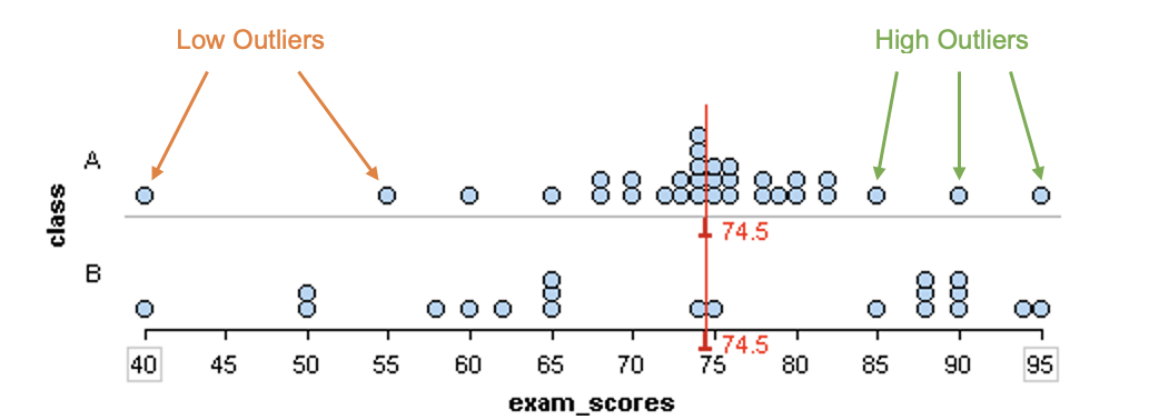
To make more sense of this rule, let’s look at a visual example.
Two sets of exam scores:
Consider the following two distributions of exam scores:
Figure 2. Two boxplots of exam scores.
For the Class A data set in the dotplot, [latex]Q1 = 71[/latex] and [latex]Q3 = 78.25[/latex], so the IQR [latex]= 7.5[/latex].