- Read information from a boxplot and make conclusions
- Compare boxplots
When we describe the distribution of a quantitative variable, we describe the overall pattern (shape, center, and spread) in the data and deviations from the pattern (outliers). A graphical visualization of a data set is very useful in giving us a glimpse into the distribution of the data set. In this section, we are going to focus on boxplots, a graphical representation of a quantitative variable. Boxplots are helpful for visualizing the distribution of a quantitative variable.
Boxplots
boxplot
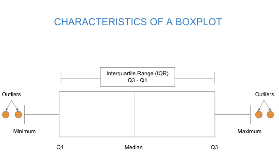
A boxplot is a graphical visualization of a quantitative variable that shows median, spread, skew, and outliers by illustrating a set of numbers (minimum, [latex]Q1[/latex], median, [latex]Q3[/latex], and maximum) called the five-number summary.
A boxplot clearly shows the center of the data set and provides a summary at a glance of the bulk of the data and the presence of outliers.
Shape and Center
Boxplots, like histograms and dotplots, can also tell us about the shape of a distribution.
- Left-skewed: A cluster of data on the right with a tail of data tapering off to the left.
- Symmetric: A cluster of data where the left and right sides of the distribution closely mirror each other.
- Right-skewed: A cluster of data on the left with a tail of data tapering off to the right.
We can describe the center of a boxplot’s distribution with the mean and median. Recall the effect that skew has on the relationship between the mean and median in a data set. A right-skewed data set will pull the mean to the right of the median, while a left-skewed data set will pull the mean to the left. We can use visual clues to observe the skew in a boxplot in the same way that we can in a histogram or a dotplot.

- Do you notice any skew in the histogram of this dataset?
- Can you point out the corresponding outliers in the boxplot of the data?
- What is the relationship between the mean and median of the data? Is the mean less than, greater than, or roughly similar to the median?
- What can you conclude about the shape of the data?
- What visual clue in the boxplot led to your conclusion?