Name and compare the measures of center shown in a graph
Mean and Median as Measures of Center
There are other ways that we can think about the mean and median as measures of the center of numerical data when we are examining a graphical representation of the data set.
The mean represents the balance point of the data (think about where you will need to place your finger if you are balancing the graph on top of it).
The median represents the [latex]50[/latex]th percentile, or the value that splits the data in half (i.e., half of the data are below the median and the other half of the data are above the median).
Consider the following histogram and determine its mean and median.
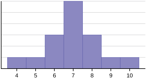
Histogram A:
Histogram A: Both the mean and median are 7.
7 is the center of the histogram, both as the balance point of the data and the bar that splits the data in half.
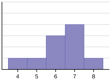
Histogram B:
Histogram B: The mean is approximately 6.3, and the median is approximately 6.5.
Notice that the mean is less than the median. The mean and median is smaller because of the skewness of the data. For the mean, in order to balance the histogram on top of your finger, you’d have to place it a little bit to the left of the peak of the histogram.
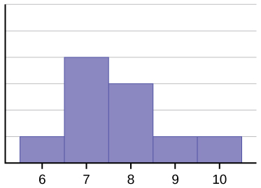
Histogram C:
Histogram C: The mean is approximately 7.7, and the median is approximately 7.5.
Notice that the mean is more than the median. The mean and median are larger because of the skewness of the data. For the mean, in order to balance the histogram on top of your finger, you’d have to place it a little bit to the right of the peak of the histogram.