- Describe the graph of a data set using its shape, center, spread, and outliers
Describing Distribution
We can use different graphs, such as dotplots and histograms, to summarize the distribution of a quantitative variable. By displaying the data in such graphs, we can describe features of the distribution of the quantitative variable. The features used to describe the distribution of a quantitative variable are: Shape, center, spread, and presence of outliers. Let’s look at the species and size measurements of [latex]342[/latex] penguins found foraging near Palmer Station, Antarctica.

Shape
To describe the shape of a distribution, imagine sketching the outline of the data to emphasize the general trend. The description of shape includes two parts: the overall pattern and the number of peaks.
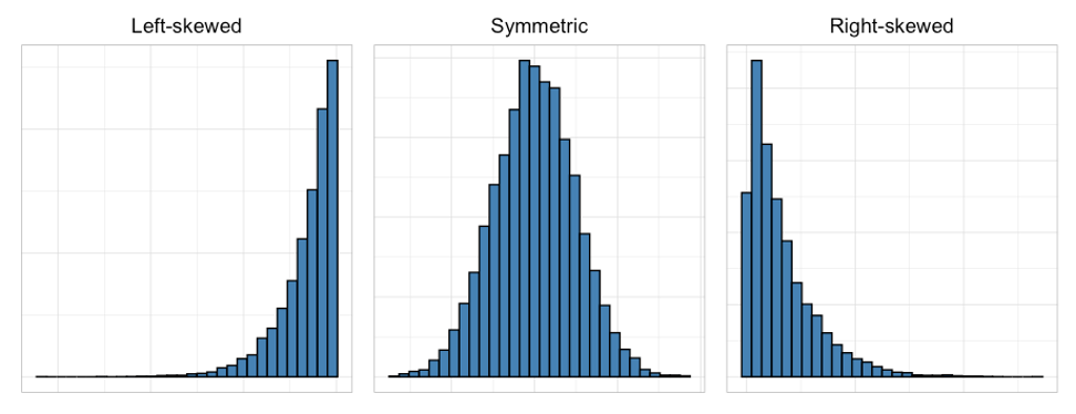
overall shape pattern
(left-skewed, symmetric, right-skewed)
Left-skewed: A cluster of data on the right with a tail of data tapering off to the left. A left-skewed distribution has a lot of data at higher variable values with smaller amounts of data at lower variable values.
Symmetric (also called bell-shaped): A cluster of data with a central peak where the left and right sides of the distribution closely mirror each other. If you drew a vertical line down the center of the distribution and folded it in half, the left and right sides would basically match. A bell-shaped distribution has a lot of data in the center, with smaller amounts of data tapering off in each direction.
Right-skewed: A cluster of data on the left with a tail of data tapering off to the right. A right-skewed distribution has a lot of data at lower variable values with smaller amounts of data at higher variable values.
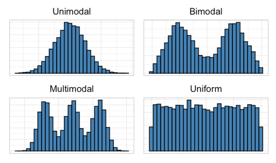
number of peaks
(unimodal, bimodal, multimodal, uniform)
Unimodal: There is one prominent peak.
Bimodal: There are two prominent peaks.
Multimodal: There are three or more prominent peaks.
Uniform: There are no prominent peaks. A rectangular shape, with the same amount of data for each variable value.