- Create a graph that displays key information from numerical data
- Explain the differences between different graphs that display the same quantitative data
Dotplots and Histograms
The Main Idea
A dotplot takes a collection of quantitative data points and distributes them across a horizontal axis (a number line). Each value is represented by a single dot on the dotplot. Identical values get stacked up, so we can tell at a glance which values showed up in large quantities in the data set and which are rarer. From a dotplot, if there aren’t too many data points, we can count the number of observations and locate the exact median of the data. We can also discern the shape of the data distribution. (Is it symmetric or bunched up to one side or the other?).
A histogram is like a bar chart for quantitative variables. It takes all the data measurements collected and groups them into bins of equal width. The person creating the histogram, whether by technology or by hand, chooses the binwidth. The smaller the bin, the finer the detail. The opposite is true: large bin-width may hide detail by flattening out variation in the data. From a histogram, we can see summary information about the data set and discern the shape and center of the data.
The two videos below demonstrate how to read and interpret these quantitative graphs.
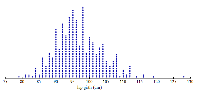
Hip measurements
Here we have three graphs of the same set of hip girth measurements (circumference/distance around someone’s hips) for 507 adults who exercise regularly.
Dotplot:
From the dotplot, we can see that the distribution of hip measurements has an overall range of 79 to 128 cm. For convenience, we started the axis at 75 and ended the axis at 130.
Dotplot with Bins:
To create a histogram, divide the variable values into equal-sized intervals called bins. In this graph, we chose bins with a width of 5 cm. Each bin contains a different number of individuals. For example, 48 adults have hip measurements between 85 and 90 cm and 97 adults have hip measurements between 100 and 105 cm.

Histogram:
Here is a histogram. Each bin is now a bar. The height of the bar indicates the number of individuals with hip measurements in the interval for that bin. As before, we can see that 48 adults have hip measurements between 85 and 90 cm and 97 adults have hip measurements between 100 and 105 cm.

Note: In the histogram, the count is the number of individuals in each bin. The count is also called the frequency. From these counts, we can determine a percentage of individuals with a given interval of variable values. This percentage is called a relative frequency.
Create a histogram for the data “Hours Watching TV (2018)” using the Describing and Exploring Quantitative Variables tool below. Steps to create a histogram:
STEP 1: Select “Single Group”
STEP 2: Select the Data Set “Hours Watching TV (2018)”
STEP 3: Under “Choose Type of Plot”, select “Histogram”
STEP 4: Create three histograms with different binwidths “2”, “5”, and “10.”
[Trouble viewing? Click to open in a new tab.]