- Create frequency tables, bar graphs, and pie charts by hand and with technology
- Answer questions using information from frequency tables, bar graphs, and pie charts
Frequency Tables, Bar Graphs, and Pie Charts
Recall that categorical data is data that is separated into distinct categories. Categorical variables are described using words. The count of each category may be displayed using a table or a graph.
frequency tables, bar graphs, and pie charts
Frequency tables list all the types of a categorical variable along with how many of each there are. Each category total is divided by the total of all the data to obtain the proportion of the total data contained in the category. The proportion may then be converted to a percentage, which is often called the “relative frequency.”
- Example: In a particular statistics class, 10 students major in business, five major in biology, and 12 major in health sciences. We can find the proportion of each major in the class by dividing the number appearing in that major by the total students. There are 27 total students given in the three majors. [latex]\dfrac{10}{27}\approx0.37[/latex], which tells us about 37% of the class majors in business.
Bar graphs can also display either the count of each category or the proportion or percentage, depending on how the vertical axis is labeled.
- The horizontal axis lists each category of the variable.
- If the vertical axis lists counts of each, the height of each bar above its category indicates the number of individual observations in that category.
- If the vertical axis lists percentages, the height of the bar will indicate the proportion or percentage of each category out of the total observations.
Pie charts display either percentages or counts of each category arranged as slices of a pie. The size of the slice corresponds to the proportion of observations in the category.
- In our example of the majors present in a statistics class, we calculated that 37% of the students major in business. [latex]\dfrac{5}{27}\approx0.185[/latex], which tells us 18.5% major in biology. [latex]\dfrac{12}{27}\approx0.444[/latex] indicates that about 44.4% major in health sciences. The percentages don’t total 100% due to rounding.
See the video below for a visual demonstration of how these charts are constructed from data collected on a categorical variable.
Frequency Tables
A relative frequency is the ratio (i.e., fraction or proportion) of the number of times a value of the data occurs in the set of all outcomes to the total number of outcomes.
| U.S. State | Frequency |
| California | 33 |
| Florida | 203 |
| Hawaii | 51 |
| North Carolina | 23 |
| Other | 27 |
| South Carolina | 34 |
| Texas | 16 |
Part A: Calculate the relative frequency of shark attacks for the state of California.
Part B: Calculate the relative frequency of shark attacks for the state of Florida.
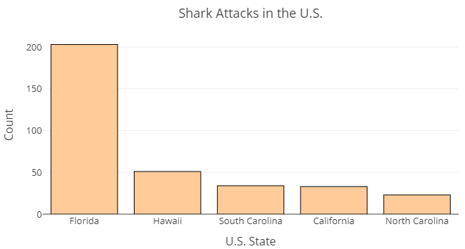
Use the bar graph to answer the following questions.
- According to the bar graph, how many shark attacks occurred in Florida?
- What two states appear to have recorded about the same number of attacks?
- About how many attacks does the bar graph indicate occurred in Hawaii?
- About how many attacks occurred in North Carolina?
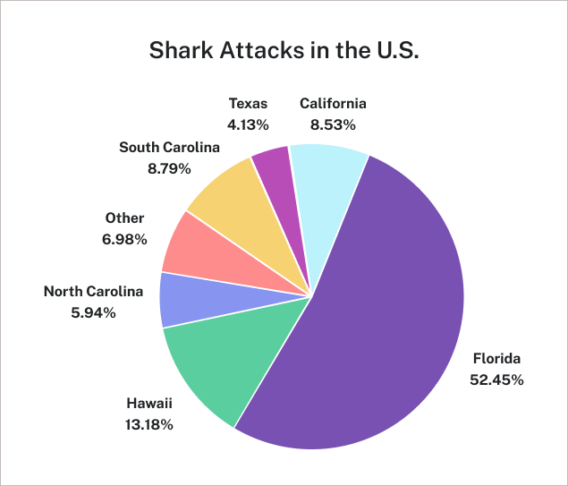
| U.S. State | Count |
Relative Frequency in Percent (%) |
| California | 33 | 8.53 |
| Florida | 203 | 52.45 |
| Hawaii | 51 | 13.18 |
| North Carolina | 23 | 5.94 |
| Texas | 16 | 4.13 |
| South Carolina | 34 | 8.79 |
| Other | 27 | 6.98 |