- Describe how the slope, shape of the data, and the coefficient of determination are connected.
- Find [latex]R^2[/latex] and describe how [latex]R^2[/latex] describes the relationship in a data set.
coefficient of determination
The coefficient of determination, denoted [latex]R^2[/latex] or [latex]r^2[/latex] (pronounced “[latex]R[/latex] squared”), is the proportion of the variation in the response variable that can be explained by its linear relationship with the explanatory variable.
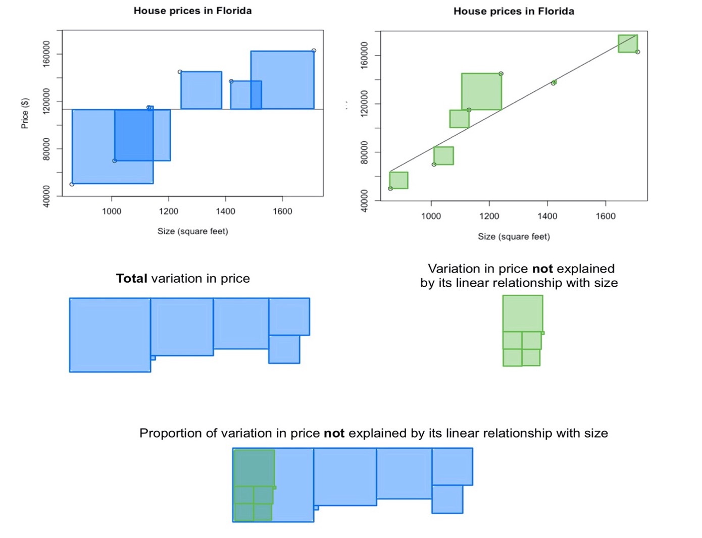
The scatterplots show the prices and sizes of six houses. The first scatterplot includes the data points, as well as a horizontal line whose [latex]y[/latex]-intercept is the mean house price. The second scatterplot includes the data points and the line of best fit. The blue squares in the first scatterplot are a demonstration of the total variation in the price; as you may recall from your discussion of variance, this is related to the sum of the squared distance from the mean. When we find the line of best fit, the distance of each data point to the line is minimized. The green squares in the second scatterplot are a demonstration of the variation in price that is left over after fitting a line to the data; in other words, the green squares show the variation in price that is not explained by its linear relationship with size.
When we compare the unexplained variation with the total variation, we can visually estimate that the unexplained variation comprises about one-fifth of the total variation. As a result, we estimate that about four-fifths (or about [latex]80\%[/latex]) of the variation is explained.
When we use technology to compute [latex]R^2[/latex] for this data set, we find that [latex]R^2=0.82[/latex]. This is consistent with our visual estimations. In other words, [latex]82\%[/latex] of the variation in house price can be explained by the fact that houses differ in size and there is a linear relationship between price and size.
The reason that we use the symbol [latex]R^{2}[/latex] is that the coefficient of determination is equal to the square of the correlation coefficient [latex]r[/latex]. Because of this, [latex]R^2[/latex] is more sensitive to differences in the strength of the linear relationship between the two variables than [latex]r[/latex] is. This increased sensitivity can be seen in the graphic below; the difference between [latex]R^2[/latex] values is greater than the difference between corresponding [latex]r[/latex] values.

We will not go into more detail here about how [latex]R^2[/latex] is calculated; instead, you will practice finding (using technology) and interpreting this value. If you are curious about how this quantity is computed, see this video on calculating [latex]R^2[/latex].