- Create scatterplots for bivariate data and answer questions from the graph.
- Describe the trend of bivariate data.
- Calculate the correlation coefficient and explain what it means.
Scatterplots
Scatterplots are used to illustrate the relationship between two quantitative variables.
| Store Location | Average Household Income ($1000s) | Number of Organic Vegetables Offered | Store Location |
Average Household Income ($1000s) |
Number of Organic Vegetables Offered | |
| S. Flores | 71 | 36 | Marbach Rd. | 49 | 38 | |
| N. Rosillo St. | 34 | 4 | Babcock Rd. | 66 | 84 | |
| Nogalitos St. | 71 | 28 | Wurzbach Rd. | 87 | 61 | |
| Fredericksburg Rd. | 49 | 31 | W. Loop 1604 N. | 78 | 56 | |
| Olmos | 78 | 78 | Bandera Rd. | 59 | 62 | |
| N. New Braunfels Ave. | 41 | 14 | S. New Braunfels | 50 | 44 | |
| Castroville | 38 | 12 | S.W. Military | 48 | 26 | |
| Culebra Rd. | 50 | 18 | S. Zarzamora | 56 | 29 | |
| S.E. Military Dr. | 50 | 65 | E. Basse Rd. | 125 | 95 |
Let’s enter the data into our statistical tool to create a scatterplot.
Step 1: Locate the drop-down menu under Enter Data and select Your Own.
Step 2: Select the box titled Use ID Variable and name the ID Variable and the X and Y-Variables appropriately given the three columns in the data table.
Step 3: Complete the data table appropriately. Then select Submit Data (you may need to scroll down to see it) to create the scatterplot.
[Trouble viewing? Click to open in a new tab.]
Increasing and Decreasing Trends
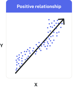
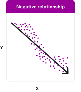
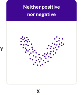
A positive (or increasing) relationship means that an increase in one of the variables is associated with an increase in the other. A negative (or decreasing) relationship means that an increase in one of the variables is associated with a decrease in the other. Note that not all relationships can be classified as either positive or negative.
The direction of the relationship can be positive, negative, or neither: