- Create scatterplots for bivariate data and answer questions from the graph.
- Describe the trend of bivariate data.
- Calculate the correlation coefficient and explain what it means.
Relationship of Bivariate Data
Scatterplots can be used to identify shapes and patterns.
Linear
The relationship between two variables is said to be linear when the points on the scatterplot resemble a straight line. The following scatterplot could be described as being linear.
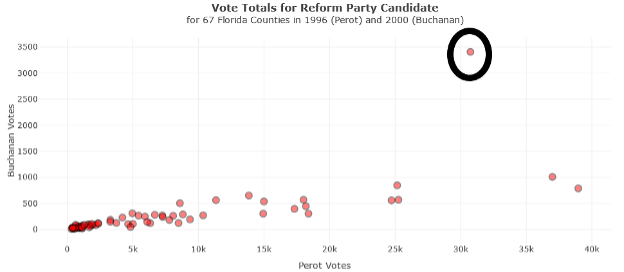
The circled point in the upper right-hand corner of the scatterplot represents an outlier (Palm Beach). Outliers appear as departures from the general trend. Scatterplots can be used to identify outliers or extreme observations in the bivariate data.
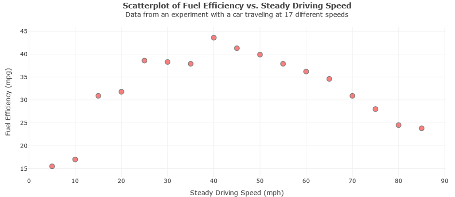
Non-linear
Scatterplots are also useful for identifying non-linear relationships. The data points can appear scattered about a smooth curve or have no patterns at all. The following scatterplot could be described as being non-linear.