- Create scatterplots for bivariate data and answer questions from the graph.
- Describe the trend of bivariate data.
- Calculate the correlation coefficient and explain what it means.
Interpreting a Scatterplot
How do we describe the relationship between two quantitative variables using a scatterplot? We describe the overall pattern and deviations from that pattern. To describe the overall pattern of the distribution of one quantitative variable, we describe the shape, center, and spread. We also describe deviations from the pattern (outliers).
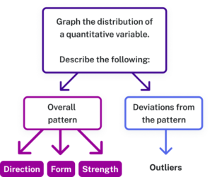
Similarly, in a scatterplot, we describe the overall pattern with descriptions of direction (trend), form (linear or non-linear), and strength. Deviations from the pattern are still called outliers.
Identifying Trends/Directions
Identifying patterns in scatterplots can help us determine if a relationship exists between two variables. Scatterplots might show positive trends, negative trends, or no trends at all.