Why Illusions?
For more than a century, psychologists and neuroscientists have studied how we interpret the sensory world. Although vision and hearing have received the most attention, researchers have also examined smell, taste, touch, pain, balance, and movement. One of the most powerful tools for studying perception is the perceptual illusion—a carefully designed stimulus that exposes how the brain organizes, interprets, and sometimes misinterprets information.
Illusions are not just “tricks.”
They reveal the rules, shortcuts, and assumptions your brain uses to turn incomplete or ambiguous sensory input into a coherent experience.
Why Scientists Use Illusions
Scientists create illusions based on what they know about the perceptual system. A successful illusion lets researchers explore:
- What people experience
- How the brain interprets ambiguous or conflicting cues
- Which brain regions support specific perceptual processes
- How attention, context, and expectation shape perception
- What variables strengthen or weaken an illusion
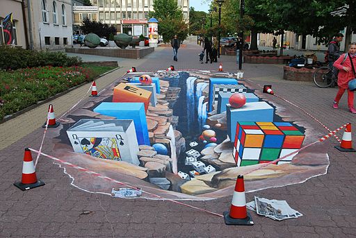
Artists use many of the same principles. For centuries, painters and designers have relied on illusions of depth, shadow, and perspective to create the appearance of a three-dimensional world on a flat canvas or sidewalk (Figure 1).
Depth Illusions
When we look at the world, we are not very good at detecting the absolute qualities of things—their exact size or color or shape. What we are very good at is judging objects in the context of other objects and conditions. Let’s take a look at a few illusions to see how they are based on insights about our perception. Look at Figure 2 below. Which of the two horizontal yellow lines looks wider, the top one or the bottom one?

Most people experience the top line as wider. They are both exactly the same length. This experience is called the Ponzo Illusion. Even though you know that the lines are the same length, it is difficult to see them as identical. Our perceptual system takes the context into account, here using the converging “railroad tracks” to produce an experience of depth. Then, using some impressive mental geometry, our brain adjusts the experienced length of the top line to be consistent with the size it would have if it were that far away: if two lines are the same length on my retina, but different distances from me, the more distant line must be in reality, longer. You experience a world that “makes sense” rather than a world that reflects the actual objects in front of you.
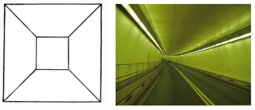
There are many depth illusions. It is difficult to see the drawing on the left below as a two-dimensional figure. The converging lines and smaller square at the center seem to coax our perceptual systems into seeing depth, even though we know that the drawing is flat. This urge to see depth is probably so strong because our ability to use two-dimensional information to infer a three-dimensional world is essential for allowing us to operate in the world. The picture on the right below is a driving tunnel, something you would need to process at high speed if you were in a car going through it. Your quick and detailed use of converging lines and other cues allows you to make sense of this 3-D world.
Light, Contrast, and Size Illusions
Depth is not the only quality in the world that shows how we adjust what we experience to fit the surrounding world. Look at the two gray squares in the figure below. Which one looks darker?

Most people say the square on the right looks darker, even though the two are physically identical. The brain interprets each gray square relative to its surroundings:
- The gray square next to a white background appears darker
- The same gray on a black background looks lighter
This reflects how the visual system enhances contrast to help us detect edges and boundaries in the real world.
Benary Cross
Here is another example below. The two triangular figures are identical in shade, but the triangle on the left looks lighter against the dark background of the cross when compared to the triangle in the white area on the right.

Shadow and Lightness Constancy
Our visual systems work with more than simple contrast. They also use our knowledge of how the world works to adjust our perceptual experience. Look at the checkerboard below.
There are two squares with letters in them, one marked “A” and the other “B”. Which one of those two squares is darker?

This seems like an easy comparison, but the truth is that squares A and B are identical in shade. Our perceptual system adjusts our experience by taking some visual information into account. First, “A” is one of the “dark squares” and “B” is a “light square” if we take the checkerboard pattern into account.
Perhaps even more impressive, our visual systems notice that “B” is in a shadow. Object in a shadow appear darker, so our experience is adjusted to take account of effect of the shadow, resulting in perceiving square B as being lighter than square A, which sits in the bright light. And if you really don’t believe your eyes, take a look at a video showing the same color tiles here.
Size Illusions: The Ebbinghaus Illusion
One final illusion takes us back to adjustment for size. Look at the two sets of circles below. Your task is to adjust the center circle on the left so it is the same actual size as the center circle on the right. The surrounding circles will not change in size, though the right of circles will expand to accommodate the size of the center circle. Use the slide bar with the label “Size of left circle” to make your adjustments. When you are satisfied with your adjustment, check your accuracy by clicking on the “Verify Diameter” button. Click “Reset” to try again.
This illusion is called the Ebbinghaus illusion, created by Hermann Ebbinghaus, one of the early founders of experimental psychology.
Here is another example of the Ebbinghaus illusion:

In this version of the illusion, most people see the circle on the right as larger than the one on the left. The two orange circles are exactly the same size. The Ebbinghaus illusion again illustrates the tendency of our perceptual systems to adjust our experience of the world to the surrounding context.