- Explain how statistics help to examine data
- Explain statistical significance and p-values
- Explain reliability and validity
- Understand how to read a research article
Drawing Conclusions from Statistics
Once psychologists have performed an experiment or study and gathered their results, they need to organize the information in a way so that they can draw conclusions from the results. What does the information mean? Does it support or reject the hypothesis? Is the data valid and reliable, and is the study replicable?
Psychologists use statistics to assist them in analyzing data, and also to give more precise measurements to describe whether the experimental conclusions are significant. Analyzing data using statistics enables researchers to find patterns, make claims, and share their results with others. In this section, you’ll learn about some of the tools that psychologists use in statistical analysis.
Analyzing Data
Using measures of central tendency, like the mean, median, and mode, are helpful to describe data in simple forms, but sometimes using those measures does not provide the full story.
- The mode is the most frequently occurring response,
- the median lies at the middle of a given data set, and
- the mean is the arithmetic average of all data points.
Means tend to be most useful in conducting additional analyses; however, means are very sensitive to the effects of outliers (data that’s extreme or outside of the normal range), and so one must be aware of those effects when making assessments of what the measures of central tendency tell us about a data set.
For example, suppose you surveyed a neighborhood to discover the average income. You learn that the mean income in the neighborhood is $100,000. You might be surprised, then, if you found that the median and mode are both $50,000. The higher number for the mean income is caused by an outlier—someone in the neighborhood must make significantly more money, but that doesn’t mean most people there do.
When we collect data to address a particular question, as in a survey, an important first step is to think of meaningful ways to organize and examine the data. Let’s take a look at an example of ways to organize data beyond using central tendency.
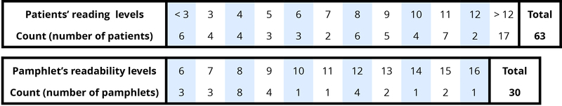
- Data vary. More specifically, values of a variable (such as reading level of a cancer patient or readability level of a cancer pamphlet) vary.
- Analyzing the pattern of variation, called the distribution, often reveals insights.
Addressing the research question of whether the cancer pamphlets are written at appropriate levels for the cancer patients requires comparing the two distributions. First, we look at the measures of central tendency.
What are both the medians? Both medians turn out to be ninth grade, but considering only medians ignores the variability and the overall distributions of these data. A more illuminating approach is to compare the entire distributions, for example with a graph, as in Figure 2.
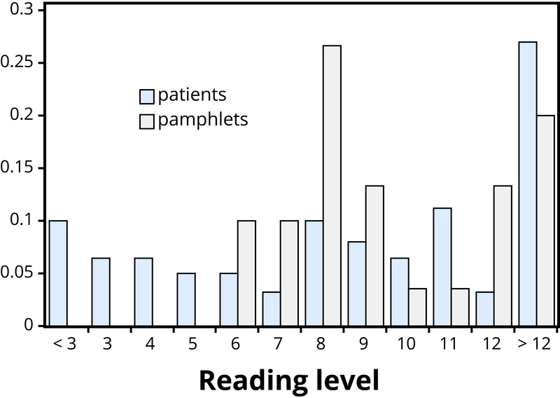
Figure 2 makes clear that the two distributions are not well aligned at all. The most glaring discrepancy is that many patients (17/63, or 27%, to be precise) have a reading level below that of the most readable pamphlet. These patients will need help to understand the information provided in the cancer pamphlets. Notice that this conclusion follows from considering the distributions as a whole, not simply measures of center or variability, and that the graph contrasts those distributions more immediately than the frequency tables.