Distinguishing Between Linear and Nonlinear Models
As we saw previously with the cricket-chirp model example, some data exhibit strong linear trends, but other data, like the final exam scores plotted by age, are clearly nonlinear. Most calculators and computer software can also provide us with the correlation coefficient, which is a measure of how closely the line fits the data. Many graphing calculators require the user to turn a “diagnostic on” selection to find the correlation coefficient, which mathematicians label as [latex]r[/latex]. The correlation coefficient provides an easy way to get an idea of how close to a line the data falls.
correlation coefficient ([latex]r[/latex])
The correlation coefficient is a value, [latex]r[/latex], between [latex]–1[/latex] and [latex]1[/latex].
- [latex]r > 0[/latex] suggests a positive (increasing) relationship
- [latex]r < 0[/latex] suggests a positive (increasing) relationship
- The closer the value is to [latex]0[/latex], the more scattered the data.
- The closer the value is to [latex]1[/latex] or [latex]–1[/latex], the less scattered the data is:
- [latex]|r| < 0.3[/latex] is weak
- [latex]0.3 ≤ |r| < 0.7[/latex] is moderate
- [latex]|r| ≥ 0.7[/latex] is strong
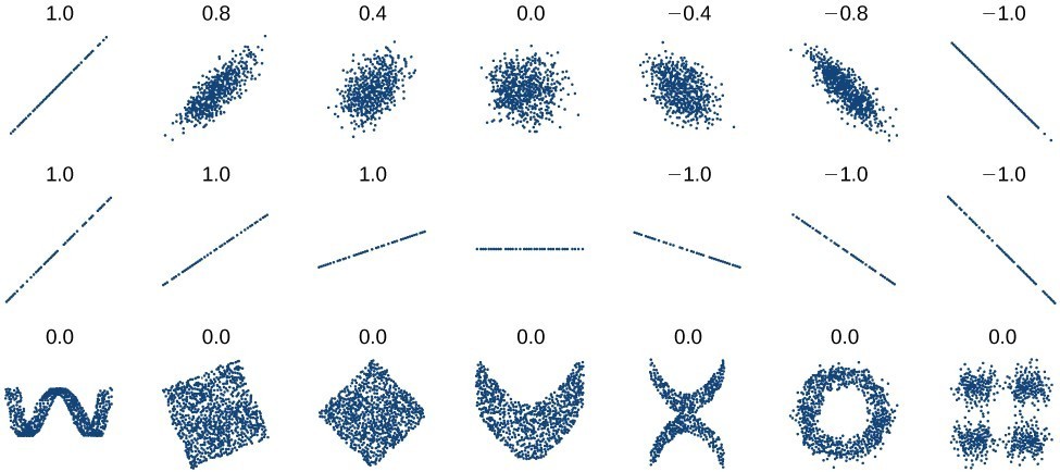
We should compute the correlation coefficient only for data that follows a linear pattern or to determine the degree to which a data set is linear. If the data exhibits a nonlinear pattern, the correlation coefficient for a linear regression is meaningless. To get a sense of the relationship between the value of [latex]r[/latex] and the graph of the data, the image below shows some large data sets with their correlation coefficients. Remember, for all plots, the horizontal axis shows the input and the vertical axis shows the output.
| Chirps | [latex]44[/latex] | [latex]35[/latex] | [latex]20.4[/latex] | [latex]33[/latex] | [latex]31[/latex] | [latex]35[/latex] | [latex]18.5[/latex] | [latex]37[/latex] | [latex]26[/latex] |
| Temperature | [latex]80.5[/latex] | [latex]70.5[/latex] | [latex]57[/latex] | [latex]66[/latex] | [latex]68[/latex] | [latex]72[/latex] | [latex]52[/latex] | [latex]73.5[/latex] | [latex]53[/latex] |

Do not interpret a high correlation between the two variable in the data as a cause-and-effect relationship.