Once we recognize a need for a linear function to model that data, the natural follow-up question is “what is that linear function?”
One way to approximate our linear function is to sketch the line that seems to best fit the data. Then we can extend the line until we can verify the [latex]y[/latex]-intercept. We can approximate the slope of the line by extending it until we can estimate the [latex]\dfrac{\text{rise}}{\text{run}}[/latex].
The table below shows the number of cricket chirps in [latex]15[/latex] seconds, for several different air temperatures, in degrees Fahrenheit.[1]
Chirps
[latex]44[/latex]
[latex]35[/latex]
[latex]20.4[/latex]
[latex]33[/latex]
[latex]31[/latex]
[latex]35[/latex]
[latex]18.5[/latex]
[latex]37[/latex]
[latex]26[/latex]
Temperature
[latex]80.5[/latex]
[latex]70.5[/latex]
[latex]57[/latex]
[latex]66[/latex]
[latex]68[/latex]
[latex]72[/latex]
[latex]52[/latex]
[latex]73.5[/latex]
[latex]53[/latex]
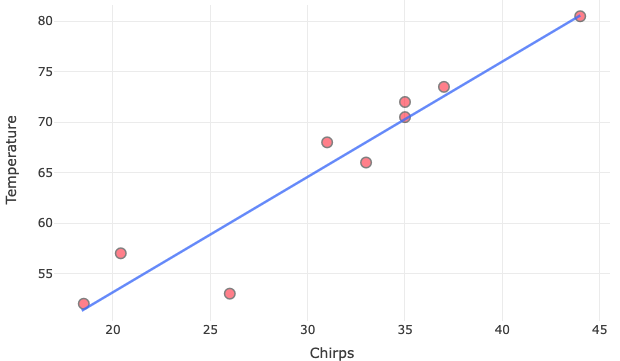
Scatterplot with estimated linear function
Plotting this data suggests that there may be a positive linear trend, though certainly not perfectly so. We can see from the trend in the data that the number of chirps increases as the temperature increases.
In the plotted data, we have sketched a line that seems to best fit the data.
What is the estimated linear function?
Note: We can only try to estimate the slope of this line by observing its steepness and direction.
Steps to Estimate the Slope:
Pick two points on the line: Choose points that are easy to read. For example, the first point [latex](18.5, 52)[/latex] and the last point [latex](44, 80.5)[/latex] are close to the fitted line.
Calculate the rise and run, and estimate the slope:
By using the points, we estimated that slope [latex]\approx 1.12[/latex].
To find the equation of the line using the last point [latex](44, 80.5)[/latex], and the slope [latex]\approx 1.12[/latex] we previously estimated, we can use the point-slope form of the equation of a line.
[latex]\begin{align*} y - y_1 = m(x - x_1) \\ y - 80.5 &= 1.12(x - 44) \\ y - 80.5 &= 1.12x - 1.12 \cdot 44 \\ y - 80.5 &= 1.12x - 49.28 \\ y &= 1.12x - 49.28 + 80.5 \\ y &= 1.12x + 31.22 \end{align*}[/latex]
So, the estimated linear function is: [latex]y = 1.12x + 31.22[/latex].
Finding the Line of Best Fit Using a Graphing Utility
While eyeballing a line works reasonably well, there are statistical techniques for fitting a line to data that minimize the differences between the line and data values.[2] One such technique is called least squares regression and can be computed by many graphing calculators as well as both spreadsheet and statistical software. Least squares regression is also called linear regression, and we can use an online graphing calculator to perform linear regressions.
Find the least squares regression line using the cricket-chirp data in the table below.Use an online graphing calculator.
Chirps
[latex]44[/latex]
[latex]35[/latex]
[latex]20.4[/latex]
[latex]33[/latex]
[latex]31[/latex]
[latex]35[/latex]
[latex]18.5[/latex]
[latex]37[/latex]
[latex]26[/latex]
Temperature
[latex]80.5[/latex]
[latex]70.5[/latex]
[latex]57[/latex]
[latex]66[/latex]
[latex]68[/latex]
[latex]72[/latex]
[latex]52[/latex]
[latex]73.5[/latex]
[latex]53[/latex]
The following instructions are for Desmos, and other online graphing tools may be slightly different.
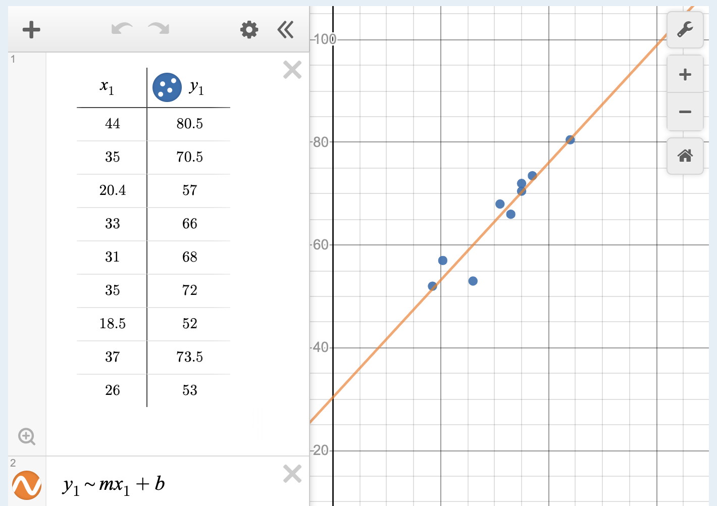
Click the plus button (add item) in the upper left corner and select table.
Enter chirps data in the [latex]x_1[/latex] column.
Enter temperature data in the [latex]y_1[/latex] column.
Chirps
[latex]44[/latex]
[latex]35[/latex]
[latex]20.4[/latex]
[latex]33[/latex]
[latex]31[/latex]
[latex]35[/latex]
[latex]18.5[/latex]
[latex]37[/latex]
[latex]26[/latex]
Temperature
[latex]80.5[/latex]
[latex]70.5[/latex]
[latex]57[/latex]
[latex]66[/latex]
[latex]68[/latex]
[latex]72[/latex]
[latex]52[/latex]
[latex]73.5[/latex]
[latex]53[/latex]
If you can’t see the points on the grid, use the plus and minus buttons in the upper right hand corner to zoom in or out on the grid, or click on the wrench and change the upper bound of [latex]x_1[/latex] to [latex]60[/latex] and [latex]y_1[/latex] to [latex]100[/latex]
In the empty cell below the table you created, enter the expression [latex]y_1∼mx_1+b[/latex]
You can add labels to your graph by clicking on the wrench in the upper right hand corner and typing them into the cells that say “add a label”
Here is an example of how your graph may look:
Graph with table of x and y values
Analysis of the Solution
Notice that this line is quite similar to the equation we “eyeballed” but should fit the data better. Notice also that using this equation would change our prediction for the temperature when hearing [latex]30[/latex] chirps in [latex]15[/latex] seconds from [latex]66[/latex] degrees to:
Steps to obtain the equation of the regression line and equation:
[latex]\\[/latex] Step 1: Under “Enter Data”, select the “Enter Own”. Step 2: Change the name of the [latex]x[/latex]– and [latex]y[/latex]-variable accordingly. Step 3: Enter the input ([latex]x[/latex]Var) and output ([latex]y[/latex]Var) accordingly. Step 4: “SubmitData” and you will see the scatterplot on the right side of the statistical tool. Step 5: Under Plot Options: click on “Regression Line” and you will see that the statistical tool will draw the line that best fit your data in your scatterplot. Right above the scatterplot, you will also see the equation of that line.
[Trouble viewing? Click to open in a new tab.]Find the equation of the line that best fit the data in the table below using the statistical tool. Is it the same or different as the one you found previously? If it is different, why do you think it is different?
Chirps
[latex]44[/latex]
[latex]35[/latex]
[latex]20.4[/latex]
[latex]33[/latex]
[latex]31[/latex]
[latex]35[/latex]
[latex]18.5[/latex]
[latex]37[/latex]
[latex]26[/latex]
Temperature
[latex]80.5[/latex]
[latex]70.5[/latex]
[latex]57[/latex]
[latex]66[/latex]
[latex]68[/latex]
[latex]72[/latex]
[latex]52[/latex]
[latex]73.5[/latex]
[latex]53[/latex]
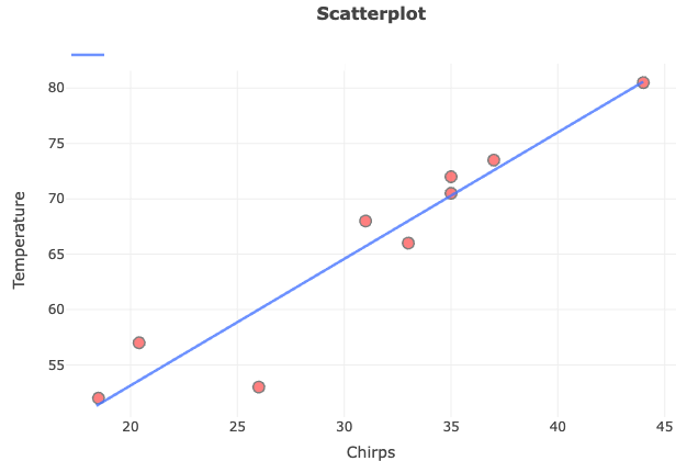
Scatterplot of chirps and temperature
According to the statistical tool, the regression line equation is
[latex]y = 30.3 + 1.14x[/latex]
Is it the same as the one we found previously? No, the two equations are slightly different.
Why is it different?
There are a few reasons why the regression line equation from the statistical tool might be different from the one we calculated manually:
Precision: The statistical tool uses precise calculations to determine the best fit line.
Data Points Used: The statistical tool considers all the data points simultaneously to find the line of best fit, whereas our manual calculation used only two specific points.
Method of Calculation: The statistical tool likely uses the least squares method, a standard approach for regression analysis that ensures the best possible fit. Our manual calculation was a straightforward approach to estimate the slope and intercept, which might not be as accurate.