Drawing and Interpreting Scatterplots
A professor is attempting to identify trends among final exam scores. His class has a mixture of students, so he wonders if there is any relationship between age and final exam scores. One way for him to analyze the scores is by creating a diagram that relates the age of each student to the exam score received. In this section, we will examine one such diagram known as a scatter plot.
A scatter plot is a graph of plotted points that may show a relationship between two sets of data. If the relationship is from a linear model, or a model that is nearly linear, the professor can draw conclusions using his knowledge of linear functions. Below is a sample scatter plot.
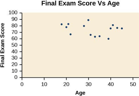
Notice this scatter plot does not indicate a linear relationship. The points do not appear to follow a trend. In other words, there does not appear to be a relationship between the age of the student and the score on the final exam.
| Chirps | [latex]44[/latex] | [latex]35[/latex] | [latex]20.4[/latex] | [latex]33[/latex] | [latex]31[/latex] | [latex]35[/latex] | [latex]18.5[/latex] | [latex]37[/latex] | [latex]26[/latex] |
| Temperature | [latex]80.5[/latex] | [latex]70.5[/latex] | [latex]57[/latex] | [latex]66[/latex] | [latex]68[/latex] | [latex]72[/latex] | [latex]52[/latex] | [latex]73.5[/latex] | [latex]53[/latex] |
Let’s plot the data to determine whether the data appears to have a linear relationship.
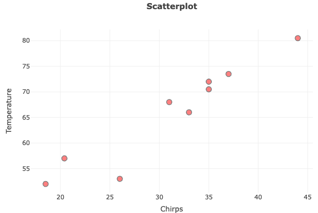
What do you think? Does it have a linear relationship?
- Selected data from http://classic.globe.gov/fsl/scientistsblog/2007/10/. Retrieved Aug 3, 2010 ↵