- Use linear functions to model and draw conclusions from real-world problems
- Sketch scatter plots to see patterns and tell apart straight-line relationships from curves
- Find the best straight line that goes through a set of data points
- Identify the differences between linear and nonlinear relations
Building Linear Models
The Main Idea
Modeling Linear Functions Problem-Solving Strategy
- Identify changing quantities, and then define descriptive variables to represent those quantities. When appropriate, sketch a picture or define a coordinate system.
- Look for information that provides values for the variables or values for parts of the functional model, such as slope and initial value.
- Determine what we are trying to find, identify, solve, or interpret.
- Identify a solution pathway from the provided information to what we are trying to find. Often this will involve checking and tracking units, building a table, or even finding a formula for the function being used to model the problem.
- When needed, write a formula for the function.
- Solve or evaluate the function using the formula.
- Reflect on whether your answer is reasonable for the given situation and whether it makes sense mathematically.
- Clearly convey your result using appropriate units, and answer in full sentences when necessary.
Helpful tips:
- You’ve probably heard the phrase “starting point” a lot, right? The [latex]y[/latex]-intercept is your starting point, and the slope guides you from there. Always remember, slope is your “rate of change,” and the [latex]y[/latex]-intercept is your “initial value.”
- When given two points, use them to find your slope.
- Diagrams are not just doodles; they’re visual aids. Use them to map out the problem and see the relationships between variables.
- Write a linear model to represent the cost [latex]C[/latex] of the company as a function of [latex]x[/latex], the number of doughnuts produced.
- Find and interpret the [latex]y[/latex]-intercept.
You can view the transcript for “Linear equation word problem | Linear equations | Algebra I | Khan Academy” here (opens in new window).
- Predict the population in 2014.
- Identify the year in which the population will reach [latex]54,000[/latex].
You can view the transcript for “Linear Modeling” here (opens in new window).
Drawing and Interpreting Scatterplots
The Main Idea
- Scatterplots visually represent relationships between two variables.
- Each point on a scatterplot represents a pair of values [latex](x, y)[/latex].
- The pattern of points can indicate the type and strength of a relationship.
- Linear relationships in scatterplots suggest a constant rate of change.
- Not all scatterplots show clear relationships; some may show no pattern at all.
Finding the Line of Best Fit
The Main Idea
- The line of best fit represents the overall trend in a scatterplot.
- It minimizes the overall distance between itself and all data points.
- The line can be estimated visually or calculated mathematically.
- Slope of the line indicates the rate of change between variables.
- The line of best fit is used for making predictions within the data range.
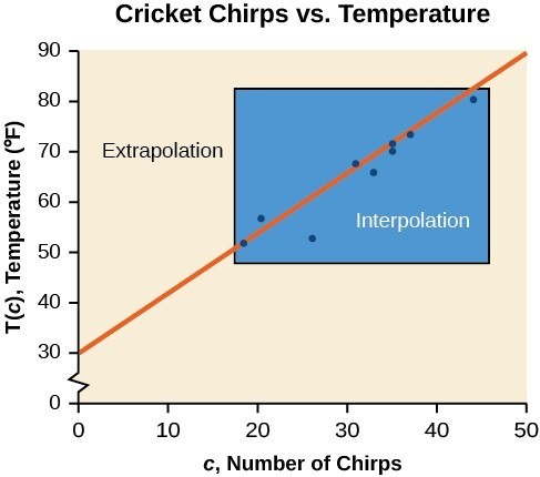
Understanding Interpolation and Extrapolation
The Main Idea
- Interpolation predicts values within the range of observed data.
- Extrapolation estimates values outside the range of observed data.
- Interpolation is generally more reliable than extrapolation.
- Both methods use the line of best fit or other trend models.
- Understanding data limits is crucial for accurate predictions.
- Model breakdown can occur, especially with extrapolation.
| Chirps | 44 | 35 | 20.4 | 33 | 31 | 35 | 18.5 | 37 | 26 |
| Temperature | 80.5 | 70.5 | 57 | 66 | 68 | 72 | 52 | 73.5 | 53 |
You can view the transcript for “What is Interpolation and Extrapolation?” here (opens in new window).
Distinguishing Between Linear and Nonlinear Models
The Main Idea
- Data relationships can be linear or nonlinear.
- The correlation coefficient (r) measures the strength and direction of linear relationships.
- r ranges from -1 to 1, with values closer to ±1 indicating stronger linear relationships.
- Correlation does not imply causation.
- Visual inspection of scatterplots is crucial alongside numerical measures.
- Nonlinear relationships require different modeling approaches.
Interpreting Correlation
- Strong Positive ([latex]0.7 < r \leq 1[/latex]): As [latex]x[/latex] increases, [latex]y[/latex] tends to increase strongly.
- Moderate Positive ([latex]0.3 < r \leq 0.7[/latex]): As [latex]x[/latex] increases, [latex]y[/latex] tends to increase moderately.
- Weak Positive ([latex]0 < r \leq 0.3[/latex]): As [latex]x[/latex] increases, [latex]y[/latex] tends to increase weakly.
- No Linear Correlation ([latex]r \approx 0[/latex]): No clear linear trend between [latex]x[/latex] and [latex]y[/latex].
- Weak Negative ([latex]-0.3 \leq r < 0[/latex]): As [latex]x[/latex] increases, [latex]y[/latex] tends to decrease weakly.
- Moderate Negative ([latex]-0.7 \leq r < -0.3[/latex]): As [latex]x[/latex] increases, [latex]y[/latex] tends to decrease moderately.
- Strong Negative ([latex]-1 \leq r < -0.7[/latex]): As [latex]x[/latex] increases, [latex]y[/latex] tends to decrease strongly.